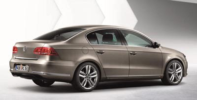
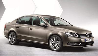
2011 VW Passat becomes ugly
Last Updated:
At least on these horrible official pictures.
The rear especially seems like a huge step backward.
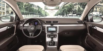
And even though the interior is pretty much the same, this new dark brown/beige combo reminds me of what Honda was doing until now.
Not at all as classy as their current black/tan interiors.
Basically, they just changed it enough to ruin it.
Thank God this will probably not make it over here, the Passat being replaced in the US by their all new mid sized sedan coming out next year.
What a total disappointment. Thanks a lot Da Silva.
The interior is ok but the exterior is about as boring as you can make a car look. This is a HUUUUGGGE dissapointment!!! I think the exterior of the current Toyota Camry looks better than this. Seriously.
I don't think it is so ugly, at least not compared to the recent model. It's not an improvement and I'm not a fan…but ugly is the Skoda Superb for example..
Agreed. And those rear lights look like a Buick.
Another ugly, bloated looking VW/Audi sedan design. Is anyone really surprised?
The Passat never looked good in pictures.
Looks like VW's plan to 'Out Bland' even toyota, and they're succeeding!
Passat= Brigitte Bardot, Kia Optima= Charlize Theron
Looks like a VW front grafted onto a current Honda Accord Sedan, and that Accord aint no looker. The front and rear both look better than the Accord, but than again, so does the cellulite on Kirsty Ally's butt.
the current Toyota Camry looks better
Well, not really. But Camrys & Accords are probally the only small sedans that are uglier than this. To be honest though, the back 3/4 view looks like a miniature version of Buick's oldest model (Lucerne). The only Buick that hasn't been totally re-done in the last 3 years.
Well i will give them credit for trying to follow a single design language, too bad every single car of theres now looks the same on the highway comming at ya, u wont even know if its a passat , golf , eos from a distance, too bad the language is old and boring ! im glad skinny tail lamps are coming back ! I hate large fraking red lenses on butts of cars !! encalve here is looking at you !~ but once again VW got that all wrong also, its vert dull and boring ! I will hold all my friends at gunpoint and make them buy a malibu or mazda 6 way before this or any VW for that matter ! im glad were not getting this and hope what we do get is alot better ! (hope)
I do agree that it is'nt ugly. It's just painfully BORING looking.
Oh, it's butt ugly and could they put the nav screen any lower? Gessh! VW SUX!
Um, actually, no. This update gets rid of a lot of the stupidity on the current Passat, most especially the awkward and ugly tail lights where they meet the rear fender. Is the front 'ugly'? No. Dull, boring, generic, perhaps. But it isn't ugly or grotesque in the way the current Ford Fusion is, or the Camry can sometimes appear.
Anyone thinking that the North American exclusive "NMS" will differ greatly then the new Passat needs to check themselves into a clinic.
I think this is the new larger US Passat replacement, look at the renderings Vince posted above, this looks identical to it.