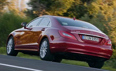
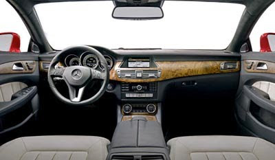
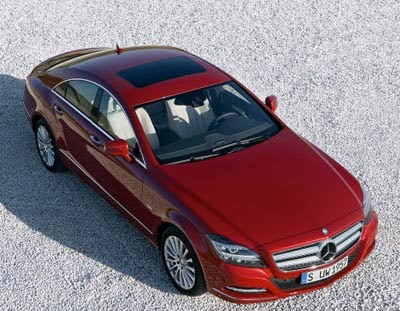
More pictures of the new 2011 Mercedes CLS

Last Updated:


In red…

It does look very nice.
But I am still not sure it looks better than the original, which I always liked a lot.

And where is the panoramic sunroof?
It would be the perfect car for it…

Conversation 8 comments

  1. Door panels don't quite line-up with the dash. Kind-of an abrupt oversight in any price range–especially this one! (note to Mercedes– look at the upcoming Chevy Aveo dash/door interface for a lesson on how to aesthetically integrate your interior design where the door meets the dash) Aside from that, the wood on the dash is very nice. Exterior is as exciting & uninspired as the 2nd generation Tarus was (trying to follow the 1st gen's break-through styling without upsetting the apple cart). Get some balls Mercedes: Once is a charm for an innovative body style; the second warmed-over time is just REDUNDANT & STALE!!!

  2. The acres of flat dash look straight out of the 1970s. And they stole the front fenders from a Volvo. Not sure that's the best place to go for design inspiration.

  3. That interior is awful. What is with the late 90s motorcycle style gauges? So dated and cheap looking!

Leave a comment

Your email address will not be published. Required fields are marked *