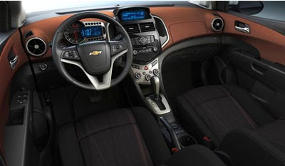
New Chevrolet Aveo interior
Last Updated:

What a giant leap forward from the current car.
And truly, a smaller Cruze interior.
At least on this picture, it looks great, for a car of that size and class.
Better than the rather boring Mazda2 interior.

Very Handsome, and not just for its classification… Period!
It looks delicious and makes me just want to eat it. Much better than the Ford Fiesta.
Om nom nom. Great job!
Looks quite nice. I'm impressed, as I was the first time I sat in a Cruze. Too bad the rest of the car is not this nice and if it drives anything like the current car then all the time that went into this wonderful interior will have been for nought. Because, as they say, you can put lipstick on a pig…
Very nice indeed and good thing, cause its so damn ugly on the outside !
Well… huh. This was unexpected. Pretty damn nice
The dash cluster looks very similar to the Chevy Spark from earlier pictures. I like the push button starter button on the left aka Porsche.
i like it too. i must say, the worst thing about chevy interiors now is – the gold bowtie.
chevy should really update it – at least maker it silver. the gold just doesn't work with anything.
If this is for real, it marks the first time in the history of cars that a "REAL CAR" dash has been available in anything this economical. Most of these little buggers have a cheap-ass dash that looks like something out of a 2010 Honda Fit. NICE JOB GM!!!!!!!!!!!!!!!!!!!
I actually get the feeling that GM knows what business they're in. Unlike the past twenty five years, they have some cars today that are legitimate class leaders. This appears to be another winner. I would like to see a little more concept car style on the exterior tho.
the he best is gettiit ng i even better go gm
douchbag jones doesnt realise that this model GM is actually a korean Daewoo. And douchbag jones hates korean cars. LOL.