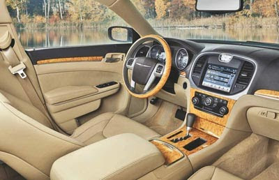
2011 Chrysler 300 interior
Last Updated:


Maybe it’s just me, but I really don’t think this is the best looking interior color.
A first impression is very important.

The 90’s beige tone with way too much wood everywhere isn’t the most modern or classiest look in 2010.

More very soon…

Conversation 20 comments

  1. Very sumptuous looking, and easily as handsome as anything in the class (and beyond).

    If this is anything similar to my recent experience with the latest Grand Cherokee, it'll be a winner.

  2. I thought it would be good — but this is SPECTACULAR!!!

    L O V E all the wood. It's about time sombody besides Jag, Rolls, & Bently put a decent amount of wood in a car.

  3. Looks terrible imho. I hate anything with too much wood unless its done tastefully. I have wooden trim in my Benz but it looks contemporary, not old fashioned like in that Chrysler 300. I like super modern and contemporary looking interiors. That interior looks old-fashioned, something an old would drive. No offense.

  4. Let's be honest with ourselves: could it be better? Certainly.

    But this is a GIGANTIC leap forward in Chrysler interiors!

    Nice to see a Chrysler beige that ISN'T a shade of rental gray!

  5. I think it looks pretty good. The wood is away to try to make you not notice it's basically the same as the dodge. I think it looks better in black

  6. I've always wondered how come manufacturers don't offer more brown (as in chocolate color) interior color options, they look distinct enough to be offered as a choice outside of the pedestrian black/grey yet it's dark enough to retain a sense of maturity and less likely to show bits of stain and wear compared to light beige/grey. same idea with red interior, they are popular in a few coupes here and there, and that's about it, yet red complements both black and white exterior very well, and those are the 2 most popular exterior colors in the world.

  7. Is the wood fake? It must be, and it's overdone and nasty. I have't seen such awful, fake luxury since the '74 Cordoba. If fake materials are going to be used, I prefer something unique, like they attempted with the tortoise-look resin (plastic) they used when they launched the current 300. If it weren't for the nav screen, this interior would look like it was out of a previous decade.

  8. This looks like a pile of dog crap.

    The interior is boring and there are NO contrasting tones. Couldn't they have used three shades of beige to break up the monotony?

    Also, what is up with the clock being surrounded by a large expanse of cheap black plastic?

    Yeah, not that much of an improvement.

    I'll take a Genesis, thanks.

  9. Is the wood fake? It must be,

    LET's TRY to be ACCURATE:

    The last 300 came in a "tree-hugger's" edition with a puny V6 & fake wood. BUT, it ALSO came in a "real man's" version with a "Real HEMI V8" and REAL California WALNUT wood on dash, doors & steering wheel. I think's it's only logical to assume this will be the same.

    (except the "puny" v6 is now a 300HP / 30MPG epitomy of efficency and the V8 runs on 4-cylindars with cruise on and on all 8 when you want to let the over 400 screaming horses loose on the highway)

    The interior is a bit too curvacious for me. Certainly better than the antiquated S-Class or 6-seeries or E-clas coupe; but not quite up there with the newest E-class sedan, the CTS, or or 7-series. Compared to the A6 or 5-series though, I would have to choose the Chrysler. And that's really the price range were in here. Besides; the exterior trumps ALL of the above mentioned.

    All things considered–it's a pretty impressive car. Desent yet distinctive design; all for under $50k (excpet SRT or long-wheelbase models)

  10. Uh, the shift knob is against the center panel. No way to grab it without using a lot of finger strength. This is a tacky mock-up and not the actual shifter. (actual shifter design changed as recently as 3 weeks ago, so they probably don't even have any prototypes from the latest supplier. Gonna be tough to get production parts that work in time for vehicle launch.)

  11. I think the wood is throwing off the whole look. It would have been really sharp with a darker wood, like Walnut or Myrtle.

    @Dan – Good catch on the shifter. I didn't even notice it until you pointed it out. Now it really bugs me.

  12. Yep the shifter, if they can't even get a mock-up done right for photographs, can you imagine once this car hits actual production all the crap you can't see that may be wrong? Good god!

  13. It has the Douchebag Jones seal of approval…That has to be better than any award Hollywood brats hand out.

Leave a comment

Your email address will not be published. Required fields are marked *