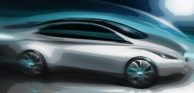
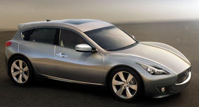
2012/13 Infiniti compact models
Last Updated:
Infiniti has already announced a 2013 new EV model based on the Leaf.
The bottom pic is an official sketch of it.
But they recently also mentioned the possibility of competing in the luxury compact segment against cars like the Audi A1, BM1 series and the new Lexus CT200h.
That means a hatchback.
I think it is great idea. Every luxury brand is doing it.
Nicer looking than FX below and probably has more cargo space. Way to go Infiniti….I may take a look at this!
Pretty cool… It (the top pic) reminds me of my old BMW Z3 M Coupe (which I absolutely adored).
I'd buy this without hesitation of it comes out looking like that.
goodness, I thought this was Mazda trying to change their design language again.
More cargo space? Hope you are being funny or sarcastic. This thing is small, but this is good looking! With Infiniti, why would anyone want a Lexus???
Wow… Perfect. They should build this vehicle as is.
January 21, 2011 5:54 AM
Nissan salesman.
The model above would look great. They just started to sell their models in Germany and I think they sell under 100 a month, but I'm always exited when I see one. And this compact looks as dramatic as the larger models. Would definitely be an eyecatcher 🙂
Like Cadillac and other car companies, Infiniti in it's most recent times has been having issues combining straight lines (Which give any vehicle a more serious look) and curves (Which if are overly done give it too much of a "Cartoonish" look). For perfect examples of this in Infiniti's product line one doesn't have to look far. Basically every vehicle that Infiniti produces (Save the G line) all are too rounded looking. The first being the FX. While the car is not overall bad looking, the overly rounded head and tail lights make it look similar to an older Hyundai. Next the M which has too many curves and circle shapes for the size car it is and in my oppinion can't be a serious contender against any car in it's class. The latest being the large QX. They seem to have only done slightly better with the mix of straight and curves.
Although these cars have great looking interiors, the exteriors seem to suffer.
The top illustration seems to be Infiniti's best interp and shows that they are getting better hang of it. If Infiniti wants to succeed they need to pick a design language that everyone understands and stick with it. I hope the top illustration fits the bill
That is a pretty good design you did considering it came from a bunch of ugly cars that no one really likes. They look like giant catfish fish that were taken out of the water and not sure which is worse. QX giant whale, FX is giant whale feces, M looks like Catfish, G looks like catfish feces, EX looks like fried catfish.
More fail from them. Sad really.
It does look like that old BMW.
I agree there designs do resemble sea world attractions