2012 Subaru Impreza
Last Updated:
What a disappointment this turned out to be.
Especially after last year’s concept.
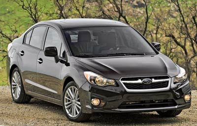
This now looks older than anything else on the market. They went for a “small Legacy” look.
Which is really not a good thing.
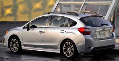
And the hatchback is especially bad. Someone here was noticing similarities to the Caliber, and they’re right.
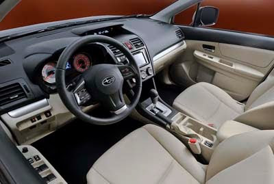
The interior does look like a step forward, if the quality is there.
I just don’t know how they could think this is fine. Who signed off on this???
I have disliked the current Impreza from Day 1, but I like the 2012 much better. Yes, it's not revolutionary, but it is classic-good-looking.
To my eyes, it looks better than the Mazda3, Corolla, Sentra and 2012 Civic. But it doesn't look as good as the Hyundai Elantra and Kia Forte
The interior looks much better, but I have to see if the plastics are as cheap and shiny as on the current model.
Yup, that's the new Dodge Caliber.
Isn't it???
These pics are flattering. Based on pics I've seen elsewhere, I'm stunned, speechless and saddened. This is one of the ugliest, most clumsy and carelessly-designed four-wheeled abortions my weary eyes have ever witnessed. Of all of the times Subaru CAN'T afford to unleash such a horror upon the market it's now. With the competition getting so fierce so fast- I'm predicting the demise of this once great brand.
What can you say about "styling" except it's a Subaru. At least the interior is a big step forward… for Subaru.
I'm sooo bummed about the new Impreza. 🙁 I had such high hopes for a decent design, but this is just outright disgusting! On the plus side, the interior looks a couple steps up. It's still nothing fantastic though. Maybe it's one of those cars that looks better in person… hopefully.
I don't know what to say about the exterior. I was waiting to buy an Impreza 5dr hoping that the update would be worth the delay (and improvements in mpg). As for the interior, they still havent figured out that red lighted instruments are HARD TO SEE ! not to mention very 80's in a bad way.
I just watched the NY auto show introduction, and they specifically state that the dash and door panels have soft-touch plastics. A definite relief after the disappointing Civic.
Okay.
The sedan is merely okay in the exterior design. The hatch just strikes me as being ugly. The interior looks like an improvement. Subaru customers must be a dedicated bunch.
A different kind of company. A different kind of car.
Oh, wait… 🙂
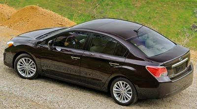
That rear view of the sedan says "little Sebring" all over it. Too bad the interior doesn't.
I don't think it is bad really. The interior is much better for one. Also I've noticed after looking at lots of press photos that the car really has a different color depending on options on the exterior and what color the PAINT is. Who would have thunk. The blue hatch they showed at New York was a terrible decision. It looked like the rental model. They should have brought the silver sport model with roof rails. It really does look better than the base model. I'm not nearly as bummed out as most people here about it and would consider purchasing it.
36MPG in an all-wheel drive car is nothing to sneeze at.
"that the car really has a different color depending on options on the exterior and what color the PAINT is"
OOOPS! I meant to say the car has a different character depending on the paint. Downright dowdy and dull in blue or brown but really looks nice in silver.
I still think its better than a civic, seriously not a lot of cars out there that are smokin these days.. Not sure what the problem is???
The current 5 door is starting to look pretty good to me compared to this…..never thought that would happen.
This car is a dissappointment. It looks like it was designed back in the late 80's or early 90's. The concept vehicle looked pretty good and implied A LOT to the production version but this????
AHHH! No one told me Subaru was adopting the Dodge Caliber! Give it back before it's to late and all the papers are signed!!!
ok, i'll say it – i'm disappointed after seeing the concept. I just don't get where designers think those small forward A-pillar extension windows are a great idea. It doesnt matter what car they're on, Hondas or this, they look like crap. And how much more forward viewing do I need? The back view is more important. You want good forward viewing?… lower the cowel! It's just another example of designers getting married to an idea before they realize its bad practice. So, the door opens wider. Whoopie, cuz I cant fit my legs thru the dash board. So why not open the entire front fender? Idiots. I never had trouble getting into the last Impreza. Its more nonsense defined by marketing types who probably defined the entire project before they even had a concept drawn. THAT's why cars are such a disappoinment from Japan lately. It looks 10 years too late from the front and like someone back-ended a Matrix from behind. So unfortunate Subaru. The Impreza was your hot young car.
I am not going to blame this on Subaru, I blame Toyota for this horrible mess, they are trying to create a corolla out of the Impreza!
Hmmm.. The WRX and STI go on for another year. Does anyone think they might be converted to the Toybaru joint disaster project? God help Subie if they let Toyota steer them. If they were smart they only have 3 trim level and then raise one of em up for some ground clearance and pop the Forester's new 170hp boxer in it.
You know none of this will matter if the WRX and STi versions are more powerful than ever, because they will remain a huge favorite with the boy-racers.
Yes SB 7 they have always been ugly and always fun to drive. Would be nice f they were both good looking and fun and put some real Recaro seats in please.The Mitsu Evo may drop out but the Korean autos are getting real good and bargain priced.
Consumers win with competition. This is not time to make an ugly car.
The top picture looks like a Subaru Honda civic
So much to respond to it's hard to know where to begin…
Yes, the plastics are much improved & soft-touch. Can't see it in the pics, but the center stack has a dark, brushed finish. Contrasting stitching in the charcoal leather pics (maybe Vince can post up).
The A-pillar windows have to be there because the A-pillar is pushed forward for aerodynamics. Without that little window, the rest of the door glass would not be able to roll down all the way.
They lowered the overall height and the beltline, so the cowl as well. They CAN'T just simply lower the cowl more because then it's lower than the hood, the height of which is mandated by pedestrian safety regulations.
So many complainers. It looks way classier than the blobby, undefined, previous model. This resembles an evolution from the previous generation Legacy, which was widely regarded as the handsomest of modern Subaru designs.
Same footprint as before, but 2012 Impreza has:
Wider track
Lower roofline
Stiffer chassis
Further improvements on already impressive safety
More cargo room
More passenger room
Longer wheelbase
Better handling
Nearly 200lbs lighter
Longer driving range
30% more fuel efficient(!)
Better quality materials and interior design
WAY better audio/NAV system
Industry-leading resale values
Most fuel-efficient AWD vehicle sold in the US
On par or ahead of its competitors' MPG, even with its standard AWD.
Plus Subaru says it's actually quicker than before.
Isn't that good enough?! Good grief, people, this is Subaru's entry-level model!! If it's not spicy enough for you, wait for the WRX, STI, or upcoming small RWD coupe. Sure looks are subjective, but if the actual improvements to the car don't appeal to you, you just don't get Subaru, or just like to whine. This will sell like hotcakes compared to any previous Impreza.
The black front-view car is the best I've seen of the new Impreza yet – channels the prev. gen. Legacy with a touch of Honda Civic. Still, compared to the concept, a big let – down. Of course, this shouldn't be surprising since Toyota has their hand in the company now. I'm amazed the new Scion FT-86 made it out the door looking as good as it has.
I was really hoping for some bug-eyes and LED's. Projectors beams, LEDs and Subies just belong together. Are anyone else's nipples hard while talking about this?
Good car with "Me, too" styling.
Too bad.
Interior looks nice. Back end looks generic but front is nice. My biggest objection is the damn mini-pillars and the corruption of the proportions of the concept.
WRX/STI will have do something special to make this stand out. AWD and good fuel economy aren't gonna do it alone. Granted, sat in a 2011 WRX recently…it probably can't get any cheaper feeling, but it can probably thank Toyota for that.
I can't stand anything copy-cat… If I see one more new car with triangular taillights with a white horizontal line through them, I will vomit.
Sheesh Subaru…. with all the talented designers available… do you think you could have made JUST ONE aspect of this new Impreza just slightly distinctive or fresh?