2013 Chevrolet Malibu
Last Updated:
After all this time, we finally get to see the whole thing.
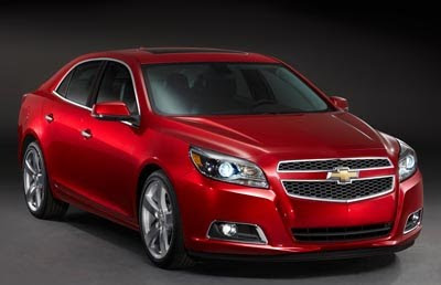
Looking pretty nice, but I still like the design of the current car better. Like I said before.
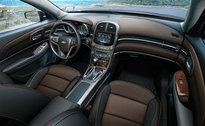
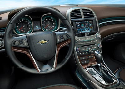
The interior does seem much more upscale and modern. Although I am never a fan of wood trim, and these pictures show too much of it.
Maybe other versions (This seems like the LTZ) do without the cheezy stuff.
This looks ready to compete with the best.
But new Accord and especially Camry are around the corner.
Here are some of the official words from GM:
“All-new exterior designed to stand out around the world
All-new, dual-cockpit interior with more room, more quietness, more premium materials and content, and greater craftsmanship
All-new, fuel-efficient, 2.5L four-cylinder Ecotec engine with next-generation six-speed automatic powertrain
All-new ride and handling package engineered for best-in-class performance
An all-new Ecotec 2.5L dual overhead cam, four-cylinder engine with direct injection leads Malibu’s engine lineup in North America. It is expected to be one of the most efficient of its size in the market. New features include enhanced authority continuously variable valve timing, variable-displacement oil pump and electronic thermostat that save fuel, while delivering V-6-like performance. It is estimated the engine will be SAE-certified at more than 190 horsepower (141 kW) and 180 lb.-ft. of torque (245 Nm). The new engine has noise-reducing features such as a cast exhaust manifold, steel crank, low-noise timing chain and direct mount accessories that contribute to a quiet-cabin experience.”
NICE!!!! Put a turbo and all wheel drive in it and I'll be sold. Unless I like the next Fusion better.
if other recent releases from Honda and Toyota are any indication, they next gen Accord and Camry will be even lamer, crappier, and more vomitous than the current models.
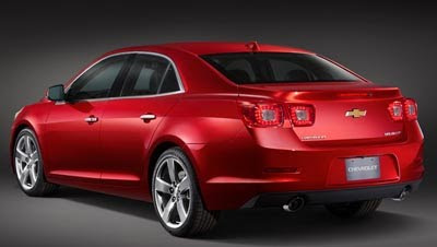
The only thing that bothers me is the taillights look like a last minute addition to the car. "Oh hey, we should make it sort of look like a Camaro, lets just save money and add the Camaro taillights!" I guess I'll eventually see it in person. Looks great other than that.
Okay.
What a groovy interior…
🙂
It looks very nice/aggresive, and one can easily see customers buying this for family transportation and the Camaro for fun, as they have share several styling elements.
i do like the rear design, the front has lost some of the uniqueness of the current model and looks derivative. agree with you on the wood trim, it's way too much, especially on the steering wheel. also, another pet peeve of mine and one that GM insists on repeating… what is up with the shifter buttons on top of the shifter itself?? why not add steering wheel paddles?
Styling is a mess both inside and out. The Camry has much cleaner lines and a better steering wheel design.
That back end is hideous, and the entire exterior is a bit bland. I can't get over those tail lights though, they look VERY out of place.
The interior looks great though…
i'm a big fan of brown color (or at least colors other than boring black, grey and beige) interior and stitching on seat/fabrics. but makers like toyota/honda intentionally de-content their vehicles in order to make their upper division more attractive. it's nice post-bankruptcy GM, the koreans, and ford willing to load up even their base models.
The square nacelles for the instruments look cheesy.
This is very "camaro like", alot of design cues. The two toned interior is very nice, still don't know why they bother with wood in some of these cars.
Nice designs, I like how GM bring it into different level instead just upgrade headlights or taillights or wheel steering. Bring Malibu to new level fusion w Camaro that perfect for all parents w children who dream to own Camaro. I love it, here's my credit card, get me black one w brown two-tone interiors. I like the interiors cuz its new, than same all over like Toyota n Honda, both car r horrible to drive n own, I own 04' n I hate it, I traded in for 08 Malibu n I loved it!
That rear looks like a baboon's inflamed ass during breeding season.
"Styling is a mess both inside and out. The Camry has much cleaner lines and a better steering wheel design."
That was worth a chuckle! Please.
Good looking inside and out. Although it is depressing that automakers continue with the fake woodgrain interior accents. Unless it's real, it's trashy and I won't ever buy a car that has it. It ruins the interior and gives in the impression of cheapness.
this car needs the new 2012 3.6 as an SS option… If it were AWD with 318 hp, it'd be a slam dunk. the 2.0T in the regal just wont do. Instead of offering a smaller turbo 4, why can't they add the seven speed dual clutch to pick up on the efficiency? I am 90% sure the ratiings would be identical when comparing to the 2.0T in the regal. If GM is smart, which i know the aren't; they'll offer at least 270hp with the 2.0T and match the ratings of the new optima/sonata.
No Maxx, no care. j/k 😉
The color and wheels make such a difference – these shots are far nicer than the blue Malibu posted earlier.
This car will look good only in white and black to hide the stupid lines. The interior is more adult looking than I thought it would be.
"That rear looks like a baboon's inflamed ass during breeding season."
ROLFMAO. OK this almost made me spit out my coffee laughing this morning. Best. Comment. Ever
I have the current Malibu and love it. The new interior is an obvious upgrade, but the rest just looks like a safe update. However, I may be in the minority, but I do like the car's "inflamed ass during breeding season." It has a great Camaro touch to it.
Interior is nice–but not really an improvement. The old interior was the best in the segment; and still is.