Volvo Concept Universe
Last Updated:


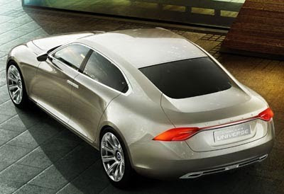
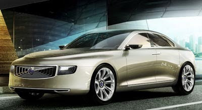
It does look quite disturbing at first.
Especially from the front.

Which could be a good thing. At least it looks different.

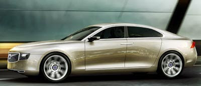
The rest of the car seems to be flowing much better.

Some people at Volvo would like to see a large sedan competing with the S Class and 7 series. Mainly the Chinese owners.
While the new CEO has denied such a car is coming soon.

We’ll see who wins….
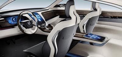
Inside, it offers nothing new besides the usual “everything looks like it’s floating” concept interiors.

Conversation 15 comments

  1. Hmm. That front end is terrible. Looks like it came from the Lincoln design team. The suicide door thing obviously not going anywhere. What's the point of this? Just a half assed attempt to maintain relevance

  2. Okay.

    It has potential, but the details are all jacked up. That front end is just horrendously bad. The overhang is just… just awful. The side and rear end look decent enough. The interior made me think Cadillac DTS on first blush.

    I'm confused. What?

    🙂

  3. The front end is growing on me- I really like it.
    Polarizing definitely but I think something different is needed in this segment. Also, it is refreshing to see something new from Volvo.

    My only gripes are that the rear end and side, while nice looking, don't quite tie in with the front of the car. Maybe make them a bit more bold while keeping the same gracefulness?

    The interior, I know it is a concept, but besides the seats, if you cover the logo there is no way you know it's a Volvo. I think that this is a huge problem. Also the dark wood is tacky!!

    Anyway, Stefan Jacoby has been quoted as saying that this is the replacement for the S80. I really hope that that is wrong and this is a bigger car than the S80 but the more I look at it, I think we'll have to wait a while longer for a S90/S100…

  4. The rear quarter view borrows from too many cars. The c pillar into the trunk is a mixture of the Saab 95 and the jaguar xf. The tail lights are a mix between the jaguar xf and the henrick fisker ev. I do see the Cadillac dts in the interior with the setup of the center console. The only thing that makes it slightly identifiable as a Volvo is the shape of the cpillar and side windows which HINT at the current s60

  5. I would have to agree with you the front looks kinda weird, but, the back is really well done. The side profile is harmless.

  6. I have only owned Volvos since i could purchase my own vehicles. It has taken me some time to get used so the new design found on the XC60 and S60…I feel that there is too much Mercedes influence in the front…thanks to Steve Mattin, the previous designer who came from Mercedes…then got fired(resigned)

    Volvo does not need to look like other cars to be successful. Peter Horbury has been a part of Volvo for years and has been instrumental in many new designs. He is going to bring back the true spirit of Volvo.

    On this one, He needs to fix the front a bit to flow with the rest of the cars beauty. It's pretty certain the production version will be tweaked anyway. I hope the back stays exactly as it is now.

  7. It's a generic design that looks like it belongs in an animated action movie. I really don't like this at all.

  8. Generic? Really? Generic would be a Mercedes E-Classe, Toyota Camry, Honda Accord. This is far from generic.

    As far as it belonging in an Animated action movie…good point since it is, in fact, a CONCEPT car.

Leave a comment

Your email address will not be published. Required fields are marked *