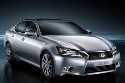
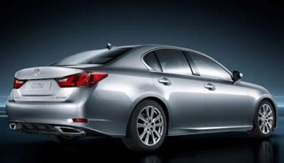
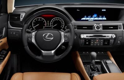
2012 Lexus GS

Last Updated:


Better pictures.

Where the car does look a little bit better too.

Interior doesn’t seem too bad.

But the exterior is still a mess, with about 3 times the amount of lines it should have.

Conversation 7 comments

  1. Definitely see the appeal of the interior, but the exterior leaves much to be desired.

    Looks like Hyundai's in a prime position to overtake this one with the next Genesis redesign.

  2. Terrible. One of the most incohesive designs to come out of Toyota (and that is saying a lot)

  3. Whoa, snore city. The nose is okay, the rest is boring. This car makes Infiniti's M look Mahvelous!…especially the interior. Lexus/Toyota is really dropping the ball…

  4. Though I know the look is currently in vogue, whenever I see a car interior that has tan or gray seats with a black dash, it makes me think the manufacturer went the cheap route and didn't bother to make the dash in the appropriate corresponding color. And why show a silver car with saddle colored seats?

Leave a comment

Your email address will not be published. Required fields are marked *