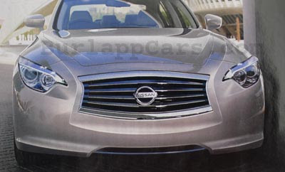
2013 Infiniti G
Last Updated:
Not sure if it is the real thing or not. It still might be too early.
But it does look pretty realistic. Incorporating cues from Infiniti’s latest concepts. As well as from the upcoming 2012 JX Crossover.
So I guess this is the new face of future Infinitis.
The current G is a great driving car. Which does look a bit anonymous. At least in sedan form.
A new more daring design would be welcome.
Dude they just keep getting uglier!
It looks like a fat cheeked sumo wrestler. Not attractive!
Infiniti's latest designs are the worst in class across the board. Even Lexus is looking more modern and lux these days.
The current G is a very smart and understated car. No bells and whistles, but it's stylish and no owner has to explain why it's a solid choice. This, on the other hand, looks cheap and cartoonish.
I think we're looking at a bad photoshop of a bad design. Look at the right side of the picture….the side view mirror looks as though it's a foot away from the car and the fender looks like it's melting.
I gotta disagree, although Infiniti is going in a new styling direction, its not as bad as Lexus……but why are both brands going with this pinched cheek design for the front fascias.
It looks like it just sucked a lemon.
Looks like a Nissan Maxima looking at itself in a funhouse mirror.
Yuuuuuuucckkkk!!!
I don't like this illustration/rendition. Overwrought and bulbous just like the M. I can honestly say it looks disgusting.
Infiniti keep getting uglier and uglier each year
Okay.
Infiniti is not that stupid.
Whew…thank goodness this is just a bad photoshop job…but I think the owl eyebrows (first seen on the LAST GEN 5 Series) are probably more accurate than we want to admit, given their latest concept.
Looks pretty accurate seeing the 2012 FX! Woof!