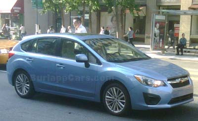
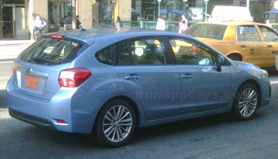
2012 Subaru Impreza

Last Updated:


These pictures were sent to me by a reader from NYC, Marcin.

As you can see, the new Impreza doesn’t seem to look much better “in the flesh”.
One of the blockiest and most boring design I have seen in years.
Looking rather cheap too.

I will file this one under “what were they thinking?”. Same folder I used for the previous generation a few years ago…

Conversation 18 comments

  1. Horrible. Front end looks like something chevy scrapped, the rear looks like something ford scrapped

  2. This is sad. Subaru was really riding a wave a couple of years back. They had a lot of buzz and attention going and they were on the verge of hitting the Big Time.

    They sure blew it (big time).

  3. With Toyota handlers….what to you expect?…its not even odd looking as you'd expect a Subaru to be. just boring and cheap….like most Toyota cars as of late.

    If WRX shares this styling and platform…it will be another fail…

  4. I can't believe the same company penned this and the XV from the same underpinnings. The XV looks ten times better (in other words, not ugly and not much more).

    They should just drop the XV sheetmetal down to street level and call it the regular impreza.

  5. I still will reserve judgement until I see one in person. The Impreza Sport model in silver still has potential. HOwever, these pictures do make the car look bad. Subaru had such a nice concept Impreza but then a whole hell of a lot got lost in translation.

  6. I will be test driving one when it comes out to consider replacing my 97 impreza wagon. Looks fine to me. 36 mpg with Subaru reliability. I don't care what it looks like.

  7. oh come on, give'em a break. AT least see the car in the flesh before making such harsh comments. Anyhow very few base level compacts look all that hot. + opinions may change w/a higher trim level.

  8. Subaru does tend to evolve its design, unlike say Honda. When they brought out the last Impreza, it was panned as dull with with bright finish grid grille and red tail lights. They kept upgrading it to meet customers desires, and sales got stronger each year. I hope they'll do that here. It could really use some LED tail lights, projector beam headlights and a rethink on the front/rear bumper covers. IF they can morph it into something a little closer to the concept (non sheetmetal changes), I think they're have a winner (eventually). And I bet it'll start with softening those rear end creases (that's one of the things that makes it look cheap to me). Cuz whether you like Toyota being involved or not, Subie did a lot of good work here on the rest of the car. Even if they still havent learned how to make a decent set of seats.

Leave a comment

Your email address will not be published. Required fields are marked *