2013 Ford Flex
Last Updated:
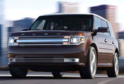
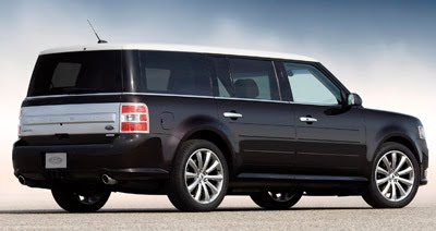
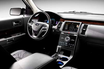
Not sure what else is new. Besides a redesigned front and and slightly revised rear and interior. Plus the new updated version of the frustrating Sync system.
The front now almost looks like it doesn’t really belong to the rest of the car. But at least they didn’t move backward. It almost looks too modern.
2013 is shaping up to be a big year for Ford. With revised versions of the Flex, Taurus and Mustang.
As well as an all new Escape and Fusion.
I like the old steering wheel better.
Interesting. Weird, but interesting.
I think they should have given it the new face from the Fusion / Taurus / etc
The Flex is an almost cool car, and I think it looks great. I've thought about how practical it would be to own one versus a sedan. But they didn't address the awful fake red woodgrain, which looks like it should be in a 1980 LTD or an Avalon, and not a modern car for people under 70.
Ford would be well-served to offer a series of aftermarket parts. I could see a set of Mini Cooper style fog lamps on the front grille and a surfboard rack for the roof. Even some different rims…not ghetto, I'm thinking BBS, HRE or Stasis.
Right now, the car is almost cool, but I feel like Ford is holding back from making it a truly fun car for people who crave an alternative to an SUV or minivan.
Wow! Old school Ford with new style! Past meets Future with this (I'm going to guess will be the last…) Flex.
I still think there's room for a newer Taurus Wagon EL (Flex), even with the Taurus Wagon (Explorer) selling like hotcakes.
It looks amazing next to the Wannbe Nissan Quest.
I knew I've seen those small HID projectors before….the Navigator! Smart. That's how you reuse materials Ford (GM is trying to become less guilty of this over time though).
imo, flex was a nice concept just poorly executed…
It still has that oversized Scion Xb look about it though
The new Honda Element…
The old one grew on me. The new front end is allot better as well as the interior
why?
Why put a Jetson's grill on a box. While the former grill was no high water mark, this one looks plain stupid and not at all in keeping with Ford's new design language.
I have to say that the new grille does look ultra modern. Looks like not much has changed except the grille. I like the interior minus the wood panels; it does like a bit old fashioned. Other than that it looks like a practical vehicle for a bigger family.