2013 Porsche 911 Cabriolet
Last Updated:
This turns out exactly like expected.
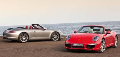
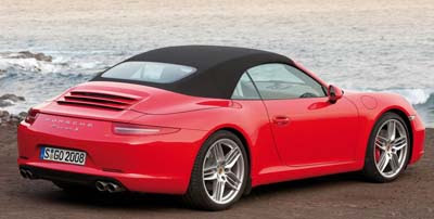
Which, I think, is a good thing. The classic shape remains.
This is exactly how a 911 Cabriolet should look like.
Last Updated:
This turns out exactly like expected.
Which, I think, is a good thing. The classic shape remains.
This is exactly how a 911 Cabriolet should look like.
I agree. Porsche has a good understanding of who they are. Unfortunately they're tied to VW, who doesn't.
Simply outstanding in every way.
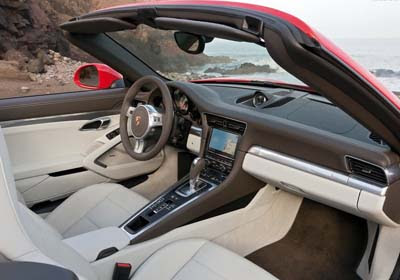
The 911's (& related) have always had a dash that was both ergonamically correct and simutaniously asthetically proper. Why can't 2-doors from BMW (6) and Merceded (E) be this great? Those 2 always have an ugly "dead" panel on the passenger side. If PORSCHE can make interiors as nice as this 911 and the Panamera; then other "sport"-lux brands should be able to improve to that level!
Great cars, but it is also time to try another design. It is getting too old in the tooth.
aging gracefully… has any other shape ever evolve so beautifully?
personal favorite shape was the outlandish / trendy whale-tails of the 1980's (probably because it speaks volumes to the consevativeness of this model); best driver's car the C2/C4's of the 90's (actually took driver effort); best performer, as always, which ever one is current (hence why this car remains significant)