2013 VW CC
Last Updated:
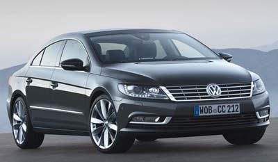
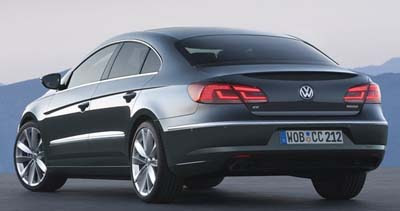
Getting mostly a new front and rear for the new year.
One that makes it look a little bit more like the new 2012 Passat.
The CC will make its official debut in a few days at the Los Angeles show.
I always thought the CC was one of the best looking sedan on the market.
And it looks like the changes did nothing to ruin it at least.
Wow definitely hotter. Especially the tail lights
ugly. looks like a car from the 90's. Boring to put it nicely
The tail light are better, but not the front. The old one was more sexy.
Something remind me the previous Acura RL…
Le Québécois
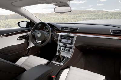
NICE! I like it. I'm considering this for my next car. It's between this and the next Ford Fusion with all wheel drive. I prefer the old grill over this newer one on the fron but I can live with this one. I love the big sunroof. Nice job VW!
It looks better now, but sightlines from inside haven't changed and must still be awful.
What I want to know is will it still be selling in North America? The CC would be the only means of getting a smaller euro-Passat with the nice 2.0T engine.
BernardP
After 5 years on the market….a refresh. VW is really starting to take things very slow…
I guess I can't complain because the NA Passat is "All-new"?
Why does it seem like VW's definition of brand cues means Copy+Paste headlights/tailights for 95% of their models? This is something I've noticed for the past 15 years…
I think it's beautiful. People really don't know what they're talking about. Folks, we do realize that this is a $30k car, right?
I don't like it at all. Way to generic looking and like every other VW now. Nothing special anymore.
I just feel that I can get a crap ton of features in other vehicles for $30 these days vs. 10 years ago.
The CC is a beautiful car–until you try to get in or out of the back seat. I'm glad VW had the guts to do this though. It leaves the Merc. version in its hindsight.
the tail lamps modernize the rear end but that front end needs work… specifically the grill, that looks terrible! the headlamps could use some revision as well. Why don't they just copy the Phaeton Sketch:
https://images.caricos.com/v/vw/2011_volkswagen_phaeton/images/1024×768/2011_volkswagen_phaeton_33_1024x768.jpg
I mean they sort of did, but stick closer to it and this car with be a success.