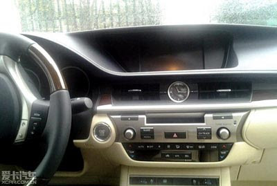
Another picture of the new Lexus ES for 2013
Last Updated:
Just thought I’d share.
A bit more details.
Let’s hope the official pics are better, much better.
Last Updated:
Just thought I’d share.
A bit more details.
Let’s hope the official pics are better, much better.
Looks like a vague rip off of BMW Dash language with very little vertical harmony…
Very nice and VERY BMW!
This interior makes me want to vomit.
The entire car makes me want to vomit.
You can actually feel yourself getting older just looking at it.
There are too many plastic shapes stacked together that don't complement each other well. Overall, it seems very 80's Isuzu to me. It looks like a confusing mess.
I just don't know what to say anymore about Lexus. They are the Japanese Lincoln. Not really a luxury brand anymore.
Please tell me that that's not a tape deck.
Looks like 3 different dashes crammed on top of each other, very ugly.
I love cars. This makes me depressed. It is like they just want to slap design language in the face. This is horrendous.
At least there isn't a sea of switches all over the place.
Oh God, the commenters on this site have BMW on the brain…
I don't see the need for an ES anymore.