2013 Chevrolet Traverse
Last Updated:
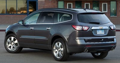
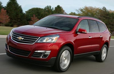
I have to say, these small changes outside do work. It does look a bit more modern and upscale.
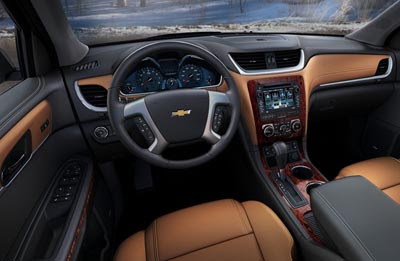
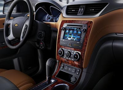
But inside… I am sure the hard plastics were replaced by better quality material. But all that fake wood does look quite tacky, and old fashion.
Let’s hope there are other options, like black or something. Anything would be better than this.
(Unfortunately, the “wood” is standard on LT and LTZ models.)
Otherwise, everything else is pretty much the same…
I know this car is based on the Buick enclave (Which is a nice looking car) but the rear side window bothers me on this car. The grill is better looking then the plastic look of the previous, but doesn't fit Chevrolet when they already have a corporate grill. The head lights and tail lights are an improvement. You could be a cross over and still have straight lines.
Holy cow! Thought the previous exterior design was very boring. What changes they made make it look much better.
Front: worse
Tail lights: Much better.
Interior: Much Much Better!
I deem it a good refreshening.
Has Chevrolet lost its mind?
The face of Chevy has been transformed in recent years with it's two-part grill with a body-colored separation. Among auto brands, this is one of the few truly unique designs that can't be confused with any other brand.
Now this.
This not-so-new Traverse has a grill that could be used on any VW, Honda, Toyota, Chrysler or a multitude of other brands worldwide. The same goes for the rear: Where is the so-called Camaro influence in the tail lights as seen on the Malibu. These lights could be on a Mazda, Lexus, Ford or just about any SUV.
Inside, Chevy was briefly developing the rounded two-cluster dashboard. That has died on recent products however, which is a shame. This Traverse dashboard truly does look like it is an amalgamation of other generic GM parts–especially the center console and center stack.
I don't get it. I've been impressed how Chevy has been able to stylistically differentiate itself. This Traverse looks like its "styling" came from GM's leftover parts bin (just like GMC used the old Saturn Outlook body on it's "new" SUV) because there is absolutely nothing seen on this vehicle which says Chevrolet except the logo.
If this continues, I think the NEW GM is beginning to act like the old rebadge-happy GM. Consumers will begin to catch on.
Sad.
I think the new Praverse looks much worse! Not sure how many GM will sell with $4 gas even with the beautiful new fake wood trim.
What´s wrong with "old fashion"?
I also don't understand why GM can't create a decent steering wheel. This one looks again too big and plasticky.
At least on Malibu and Impala it's bad and this looks the same.
Ugly Chevrolet. No surprise there.
I am sure the interior will be awful as usual too.
i thin its actually "tortise shell" like jeep used to use.
This is such an exciting design, I cannot stop yawning.
The current Traverse is good looking, and so is this mid-cycle update. The interior is shaped nicely, but would look a lot better without the trashy fake wood all over the damn place. With such conspicuous corner-cutting, fake wood just tells me that they have no problem fooling the buyer wherever they think they can. I don't expect wood in a Chevy or any mainstream car. Just use a different material, one that won't rub off.
They use wood to break up the monotony of the surfaces so it doesn't look so dull…An all-black/mono interior is the sign of a dull infantile and psychotic mind.
"They use wood to break up the monotony of the surfaces so it doesn't look so dull"
I think that a "psychotic mind" is a bit extreme, don't you? No one is questioning the creative concept of using wood. People are questioning the use of an adhesive sticker or molded plastic that simulates wood. Faux wood is a sign of bad taste. And probably easily fooled in other ways.
1. The face doesn't match the Chevy identity (just upsize the Equinox grille).
2. The rear on the Traverse was it's most unique, and best, feature. This one doesn't match the Chevy identity either except for the awkward Camaro to Malibu to Traverse taillights.
3. The interior is an improvement but who thought that that orange color should be paired with fake wood! One or the other people, but please not both.