2014 Chevrolet Impala
Last Updated:
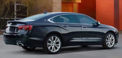
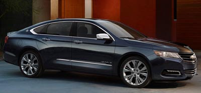
This looks a bit weird to me.
Maybe there is too much of the Buick LaCrosse in the proportions. Or something.
The cut line for the trunk doesn’t really look good. Just like the new Lincoln MKZ, this is another new sedan that would look better as a hatchback.
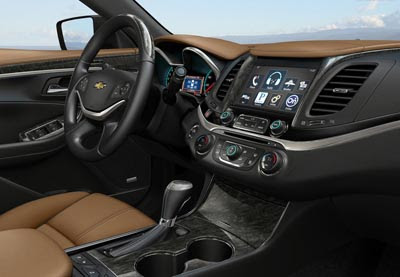
Interior seems pretty nice, especially the ash colored fake wood which looks much better than what they use in the 2013 Traverse.
It now comes standard with a 2.5 Liter 4 cylinder engine, with a 2.4 eAssist as an option. As well as the popular 3.6 Liter V6.
Luxurious car,it will be a new avatar of excellence in sedan segment,in my opinion chevrolet always launch such car that provides pleasure of ride and comfort,new Chevrolet Captiva is very fabulous and grand in features launching in India soon
It seems to also channel a lot of the Honda Accord from the front angle. I would have to see this in person. On another note, I saw a Chevy Orlando the other day in Niagara Falls. It looks like a nice car and I don't understand why GM will only sell it in Canada. Another bad decision?
This is going to sell like crazy. Overall, it looks stately and smart. I agree the rear end design looks "off" in these pics. The tail lamps look like they're from a Jetta. I'll see how it looks tomorrow at the show. But I don't agree that it needs to be a hatchback. The midwest is critical for the Impala, and people in the flyover states want a trunk. Nor do they care if woodgrain is real or not. The interior looks derivative but very good. IMHO, fake woodgrain automatically puts a car into a much lower classification than cars that either use real wood, or use another type of finish. So I do wish that GM would fix their addiction to using it.
Except for a couple of minor digs, I do like this and look forward to seeing them on the road.
THis is a confused mess. The proportions are wrong…the c pillar seems out of place – even the interior seems busy.The front end is trying something (maybe to be a softer camaro?) but doesn't quite make it.
I need to see it in the flesh
overall, nice stance, way better than the current car (it would be hard to be more bland).
the trunk cut line is weird, and have you noticed the strange filler pieces above the headlamps? at first i thought they were adapting bodywork from the lacrosse, but nope. reminds me of the strange filler strips from the previous maxima's behind, around the taillamps, as though the design was changed at the last minute, and body colour filler strips were implemented to allow changes to tail and head lamp shape. weird.
That's it? Seriously?
All of that teasing and waiting and this is what we got? It has the same character line that the Buicks have, and it comes with a 2.5 standard? Talk about underpowered and just trying to up their cumulative EPA figure for CAFE. Lackluster to the max.
The new Azera is going to eat this things lunch, as will the new Avalon.
So is this an Impala? Or an Azera? 😉
big improvement , but large, heavy looking, almost suv ish
looks like a Crosstour from some angles.
Absolutely Gorgeous!! The interior is stunning! The character line on the side resembles the old '60's cars. Home Run!
It seems to be the big thing now with designers… the accent line that descends as it comes forward over the rear wheel arch. See Acura ILX for another lame use of it. The only thing I dont like, is the Hyundai like rear. Though, when the tail lights go on, it looks Chevy Camaro. Overall, not bad. Looks bold and American.
I agree Vince, It does look weird like 3 different cars in one…. Front…middle… and back.
Sure the back-end seems a bit 'bloated', and the overall shape looks like the (hideous) CrossTour's far better looking sister, but it sorta works as an overall package – We'll See.
kinda reminds me of a honda crosstour; seems like it should work until you see all the pieces together.
hopefully maintains the ability to fit 3-child seats in the back (limited selection of cars that can do that).
chevy appears to be abandoning the crossbar in their grilles. makes the cars look strange to me. they need to work on a common language so you can tell its a Chevy.
It's not a bad looking car. The new grill is better then the (Current?) grill. The rear quarter could be mistaken for a Hyundai.
About what I expected… but Chevy is wrong to give-up on its previous corporate grill. This new grill, and the one on the revised Traverse, looks like a VW rip-off at best. It's now generic and anonymous.
The front design reminds me of the accord crosstour.
Not looking so good. I expected better… however this will definitely sell.
Beautiful car.. I can't wait to see it in person.
The proportions are wrong especially in the read which looks too big and wide.
It's a huge improvement over the current model and the rest looks quite nice and luxurious.
I've been anticipating this car for several years and had high hopes that Chevy would bring back some of that 60's excitement to the Impala -like the fabulous '65 and '67 models. Overall I think this is a great looking car and am only a bit disappointed that the tail lamps don't show that classic "3-Bullet" style that was unmistakeably Impala. Now both Ford and Chevy have great looking "big" sedans once again!
I like it. One of the best looking C-piilars going. Nice Job Chevy! It just needs better tail lights and minus off that tacky chrome mustache on the trunk.
Although this looks nice, the front end screams Acura and the rear screams Hyundai Sonata.
I'm curious to see who buys this with the 2.5L.
– FusioptimaSX
S.
M.
H.
GM of North America just has to deny us the Caprice and sell a big front-drive (which they won't bother selling an AWD option for). This and the Avalon look like Taurus, Crosstour, and Azera bullied them into dressing alike. And offering a 2.5 liter four makes me think they dug the Iron Duke up from the grave of its ancestor Lumina.
BUT…you will see these in the hood and in fleets soon enough, so there's no escape.
I like the exterior a lot, but I have always hated GM interiors and this is no exception. The exterior shows that they are following ford and VW and Hyundai and Kia in the premiumization of their brands appearance. Just sucks big time that there is no AWD to be offered with this car. Pathetic.
"Although this looks nice, the front end screams Acura and the rear screams Hyundai Sonata."
Much more successfully executed than either the Hyundai or Acura.
The new Avalon looks better but this doesnt look too bad
the new Avalon looks better? That thing is a hideous mess. This car is styled decently. It just needs better tail lights, the Chrome removed from the trunk, a nicer interior, good balance, rwd and a slick manual transmission…..oh wait…this car does kinda suck when I start thinking of what an Impala should really be.
Chevy should have offered this in Australia or China first. Then the usual complainers here would be bitching and moaning about how awesome it is and how great it would be if it were sold here.
Just to end the confusion, this is much better looking than the mildly retarded looking Avalon.
There must truly be no original ideas left in car design. It seems that one manufacturer takes a direction and everyone else mimics it. And these days, with perhaps the exception of Chrysler, it never seems to be the American manufacturers that set the standard like they once did. This car is a shameless clone of the upcoming 2013 Toyota Avalon. Look at a side profile of the new Malibu next to one of the new Camry. You can't even tell them apart. And with the exception of its stolen Aston Martin face, the new Fusion is so similar to the Hyundai Sonata it's embarrassing (for Ford). If anyone has an original idea for a car design, please send it to GM or Ford. They are in desperate, immediate need of one.
Ugh.
I don't like the design. It just doesn't work. I'm with you Vince…it looks weird. But what I never understood is why Chevrolet called a full size car "Impala"…that't disturbing. If a car is called "Impala", it should be a sleak, light coupé.