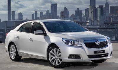
2013 Holden Malibu
Last Updated:
Ever wondered what the new Malibu would look like without the Chevrolet grille?
Look no further. Introducing the Holden version. Carrying the same name, Malibu.
I don’t think it looks better. More chrome…
The new Malibu is still an more awkward version of the previous solid design. No matter what the grille is…
Given that the last generation Malibu was one of the best looking vehicles in its class, one can't help but be disappointed with what they've replaced it with – This new design completely lacks an semblance of aesthetic cohesion, with this Holden version being even worse with the bulky/tacked-on front fascia.
I like the new Malibu. It's a smart looking car, just like the previous one which truly revived the nameplate from the depths of mediocracy. This front end design isn't good. Strange mash-up going on there.
I still find it weird that the previous Malibu was running a 112-inch wheelbase (same as the previous-generation Malibu MAXX) compared to the 108-inch wheelbase of the larger Impala.. and now for 2013/2014 the Malibu shrinks to 107.7 and the Impala grows to 111.7.. so basically the "new" Impala is the "old" Malibu with a new skin, while the "new" Malibu reverts to the wheelbase of two generations ago!
Not as elegant, but thus is change. See: 2008 Honda Accord.
I just drove the most recent Malibu (2011 or 2012) as a rental. I was annoyed that GM sacrificed substance for style. The car is very cramped for something as big as it is. Small trunk opening, tight rear seat, and a low roof and high sides that make it feel claustrophobic. It does ride and shift well, though, and it averaged about 27 mpg in mixed SoCal driving.
Strange beast this Malibu….At first glance it looks pretty good, but the longer you look at it,the awkwardness of the design shines through.A bit bland too,not'Toyota bland' but its very own blandness. Given Long Islands Matt's comments above, I don't think this car will sell well here in Australia.