2014 Toyota RAV4
Last Updated:


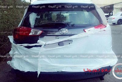
Finally we see something else than a totally covered up prototype.
It looks..Well, I’m not too sure.
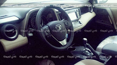
The front end seems a bit complicated. And the interior, at least on this picture, looks like quite a mess of many different shapes that don’t really go together.
But this is pretty early.
We will see much more soon…

I can't stop vomiting!
Front end looks slightly better. Interior look a lot worse. How the hell is Hyundai making better looking cars than Honda and Toyota?
Looks like it's going to be even bigger than the current version…
Which begs to question the point of having two Camry-based lite-utes (this and the Highlander) in the US lineup when they're so similar in size etc. ?
I thought it was going to be more wagon like. perhaps encompassing the matrix styling but these photos look more evolutionary of the current Rav.
The front end looks quite integrated and I don't see anything "complicated" there. The back looks nicely styled, nothing weird. I think it will end up with a similar overall profile similar to the Subaru Outback. The interior is a little hard to tell, but it does look like they are going for a more soft-touch and better quality than the last Rav. So far, so good.
Another anonymous car from an anonymous carmaker.
Jtz: So tell me. Why is it that no one said it copied the Audi tail lights but when the 2014 Sorento arrived that was said?
I agree with you Vince, a mess it is. The back looks like a Sienna minivan and the steering wheel is horrible.
The back end kinda looks like the Sienna, and I have no words for that interior. Yikes!
The back end is nearly indistinguishable from a Sienna.
The current model have a nice interior but with hard plastic. And you know what, I prefer that than an horrible soft-touch dashboard !
I don't mind the exterior, it'll look as it should… a toyota crossover. I am going to miss the more minimal approach the current rav4 front end takes. My only concern is the interior… its so unnecessary! Make the air vents a little more premium accented, and change the cover for the gauge cluster, its such an odd shape, would make sense in a 4runner, tacoma, or tundra, but not in here, and make an overall more cohesive dash.a
Lets be honest, it looks like crap; but pretty hard to tell from these poor photos, so I'll wait for better photos to make a final judgement.
At lest it looks like Toyota gave the RAV a real hatch, and moved the wart of a spare on the back under the rear end.
It is no Peugeot, thank God.
You will know it is a Toyota by its exterior desing.
Interior looks fine to me. Good job Toyota. Nice update.
Highlander rides on the Avalon platform
A mess of different shapes that don't go together is what Japan does best.
Those people have no sense of class of style.
Well all the haters better get used to them because they are going to be everywhere.
What Toyota did well was make basic transportation. Most would agree it is what they do best.
However, they really don't do "high end" very well. As a result, today's Toyota styling is more than just a little confused; Toyota's styling is MANIC.
Truly, all they would have to do is chuck their North American design bureaus, and send us what they sell to everyone else.
from JAPAN
『NEW MAZUDA6 WAGON』
↓ new photo
福田隆二