2013 Honda Accord sedan
Last Updated:
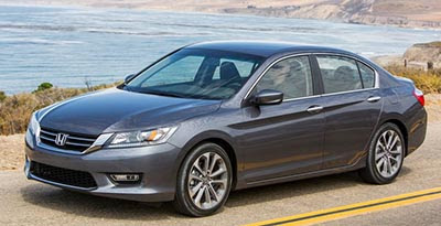
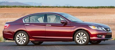
The “classic” (boring) design seems to work much better on the sedan.
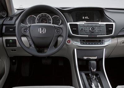
The interior seems more upscale, but also, what a mess of button and switches.

Last Updated:


The “classic” (boring) design seems to work much better on the sedan.
The interior seems more upscale, but also, what a mess of button and switches.
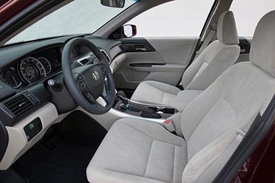
Take a look at the folding seats. It's only a pass through opening. Not sure what Honda was thinking?
Coupe I wished would have changed bit more. Now it looks like refresh.
Interior looks ok to me. But dashboard info screen and nav still look badly outdated (any cheap smarthphone has 3D graphics and why no hi-res color info screen).
I will take the grey please. The maroon is wearing the standard, stupid looking base wheels. Regardless, it will be another best seller.
Make that Classic, Elegant, timeless design that will look good in 10 years. Unlike your swoopy already looks old, Sonata
Vince, Im dont know what you mean by a mess of buttons and switches. The steering wheel has about the same buttons as most any midsize car these days with cruise, radio controls, and Bluetooth functionality. The console contains radio controls which look pretty simple to me. And the HVAC controls albeit contains more buttons than your Camry or Altima, is automatic so most people will just be pressing the up and down keys anyhow. The only improvement I could see is that they could have integrated the HVAC display with the top display.
This new Accord is attractively bland and seems more upscale than any other sedan in it's class. Honda could have done a lot worse with this redesign.
The front looks like the previous Sonata, the rest looks like the current Genesis. It's amazing that the Japanese designers could possibly be using Korean designs as a benchmark.
This car will likely be a hit with the mainstream large sedan buyers. Good for Honda!
Looks like a Sonata?? This car had Homda dna all over its front end. Do you people even compare before you post?
I think Vince has something against Honda. I also think the center console is clean. And the information screen is standard on all models. Vince only posted the lower trim here that's why the screen look low res. Get the nav and the scree is a lot better.
I'm applauding Honda for include so much standard equipments with this version including alloy wheels, back up camera, big screen info display all standard even on the LX trim
Vince,
You lack objectivity MOST of the time – and this is one of those times. You are always, ALWAYS focused on style. Just how many ways do you believe you can slice and dice a production vehicle that is focoused on the mainstream buyer? How many swoops and character lines do you believe or left that haven't already been tried before?
Make that Classic, Elegant, timeless design that will look good in 10 years.
How broke do you have to be to hang onto the same cheap Honda for TEN LONG YEARS!???
But the outside is not that bad. Honda addicts are style-blind anyway. The dash is the same as before except for a big step backwards in ergonamics when it comes to all these teeny tiny buttons.
On the one hand, it's an economy car–so, so what. On the other hand Hyundai, Dodge, and Ford all have much better cars and Toyota and Chevy (cruise) are just as good.
Honda should have spent a couple more years working out the flaws and kept selling the current model till 2015. It would have made for happier Honda-o-philes.
"(VINCE)You are always, ALWAYS focused on style. "
Of course he is. These are PICTURES. No road test. No customer survey or long-term durability testing. Style is about the ONLY thing you can judge from a photo!
I remember when I used to appreciate Hondas designs. What happened?????????????????
The interior is a mess.
The exterior is an awkward redo of the previous gen. Like the civic, this car appears to have gone backward.
The coupe is now just plain ugly. The previous one was a styling gem till its refresh. Round gogs in a square hole. Right on… good gawd. Some firing needs to be done at honda design.
Thinking back to the prelude and missing it….(yes, even it had one really ugly generation too just beofere it finale).
I was really rooting for Honda, but other than the standard features, this is a disappointment.
I somewhat feel bad for saying this, but I'd still choose a Sonata over the Accord and the Sonata is far from a new model at this point. I've had a couple as rentals for business and I loved them. Also, when you factor in Honda's pretty crazy pricing, I see no reason not to get a loaded Sonata or Optima over a mid-level Accord.
That "Sport" trim does look pretty decent though, so that's a positive.
For everyone's information: the top gray Accord is the "Sport" package; the maroon Accord is the EX-L V6, not the base model as so many have assumed here; the interior pic is an LX interior (look closely- no leather wrapped steering wheel) and does not belong to the above maroon sedan (I might add that I think this interior does look pretty nice). Got this info straight from the press pics.
"(VINCE)You are always, ALWAYS focused on style. "
Of course he is. These are PICTURES. No road test. No customer survey or long-term durability testing. Style is about the ONLY thing you can judge from a photo! "
Did you bother reading the specs of the vehicle at all?
I suddenly have a craving for vanilla wafers. Hmmm…
The stupid brats are angry that Honda didn't make it look like a vulgar cartoon car like the Batmobile.
I definitely like the Honda Accord. I will say though, that I am a bigger fan of the "sport" model. I think Honda's look great when they are sporty. The angles are much better, especially the front of the car.
Honda has lost their way. Boring redo of previous generation Accord with dashboard full of buttons and crazy-looking lines. Note to Honda – you need to study Audi interiors (or similar) to understand that less buttons means better ergonomics and a better-looking design. We were looking at possibly buying one of these when I heard they were going to get nearly 40 mpg highway, but the CVT and ugly styling drove us away. Honda is slowly becoming mid-pack compared to their competition.