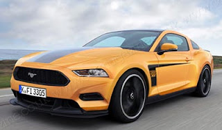
2015 Ford Mustang
Last Updated:
This is just an illustration from “car” magazine.
But it does seem pretty realistic. Retaining the popular retro look of the current model.
The whole thing on a smaller, and more modern platform.
The current Mustang drives like a car from the early 80’s and something more modern will make a huge difference.
Especially in Europe where a car like the current Mustang is too big and unrefined.
As we already know, the next generation will be sold in Europe. Which means smaller and more efficient engines. Finally….
This is not an improvement. I actually like the current design better. This front end is a little wimpy.
I really like the current design, but agree that they'll need to do something significant with the next one. One of the design elements that really bugs me about the current car are the rear side windows. They look like a gimp limb. I think a new design would help a lot.
They better not make the power-to-weight ratio worse.
Today for the V8 it's 8.6 pounds per horsepower, it better not become 9.6.
Wow! Looks different. Good upgrade!
Looks like a Fusion 2-door hatchback. Not bad–just not all that good. And certainly not that "in-your-face-thrill" that the current design has.
europe requires a 4" object to pass over the engine (how many europeans with 4" heads get sucked under the bonnet anyways?); sure hope the V-8 remains for america anyway.
Too vaginal looking to be a true Mustang.