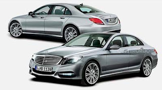
New 2014 Mercedes S Class Illustration
Last Updated:
This is the closest thing I have seen to the spy shots. So far.
And it looks just fine as the big, classic Mercedes.
It will be joined later by a coupe and, for the 1st time, 4 seater convertible version.
(Mostly) tasteful, restrained and elegant. This is what an S Class should be. Though it is still speculation, and the minor details (like the nearly horizontal bodyline above the sill and the gracefully shaped taillights) could still be wildly inaccurate and ruin it like they have the E Class.
Looks like the 2002 front end came back. Which I consider a GOOD thing.That rear looks a bit awkward…and Asian.
– FusioptimaSX
Fusioptima — it should look familiar to you — since it appears to have been lifted directly off the Equus!
Safe & Predictable.
So… It's essentially the same basic shape/car sans the 1st generation Ford Focus fenders and a 2009 Acura RL rear end grafted on – How (NOT) Thrilling.
im sorry.. but this looks aweful.
I certainly don't love it–but ANYTHING would be an improvement. How can a company that did such a great job on the E-class sedan and GLK and even the latest GL… have such a mess for their top sedan for so long????
Hyundai EQUUS, period.
Okay.
I am just not a fan of Mercedes' design philosophy. It's been a long time since I've found any of their designs remotely attractive.
This does absolutely nothing for me.
All of the german brands' "flagships" have become anything but flagships. Now it appears that these cars are all derivative of their entry level cars.
I still think the current model is hot. I think this interp looks good though. Not as funky looking as some of their newer designs. I like the rear end. Tail lights look more like the CL