2014 Buck Lacrosse
Last Updated:
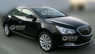
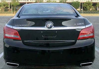
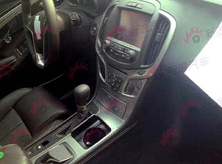
These are obviously the Chinese version of the Lacrosse.
But so far, the Chinese and US versions have looked the same. So these changes could very well end up in the US next year.
I don’t really like what I see. After a few years on the market, I think the Lacrosse is still a very good looking car. The changes outside don’t really seem to improve anything.
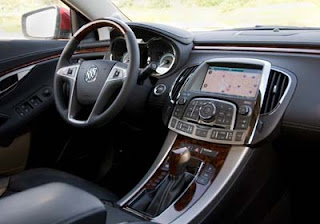
And the current interior is one of my favorite. My only critisism is the overuse of cheap looking plastic chrome.
But this “new” interior really seems like a step down. Not at all as slick as the current one.
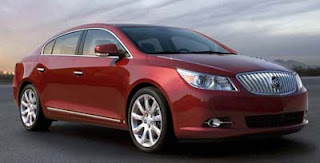
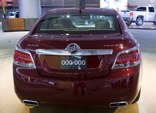
As a reminder, here are a few pix of the current model.
The console design is so much more modern than the spy shots above.
Let’s hope the “revised” version stays in China…
I wouldn't be surprised to see that on the US version as well. They are trying to update the company face to more resemble the Verano and it's not bad looking.
I wouldn't be surprised either.. the Enclave was completely blanded down in this year's refresh, with cheaper-looking headlights and the ill-advised blackout C-pillar. I don't object to the Verano-like front end on this, but the extension of Verano's chrome taillight eyebrows completely across the Lacrosse trunk looks horrible.
interesting problem alot of these niche car makers are facing; like smart, it appears that everyone who wants one already has one…
The rear end lost some elegance…
They would be wise just to keep this freaking eyesore in China.
I own the current edition Lacrosse. Great car, but one MAJOR problem I did not notice on the test drive — the car has HUGE 'A" pillars which creates the worst blind spot ever. I had to train myself how to drive the car without hitting another vehicle or pedestrian, and I've had some close calls.
This is UGLY, u-g-l-y MMC. Why did GM ruin this vehicle?
@January 1, 2013 7:05 AM
I had one as a rental and I concur. Although, I didn't even like it enough to consider buying it. It really didn't do anything that well in my opinion, no offense.