2014 Cadillac CTS
Last Updated:
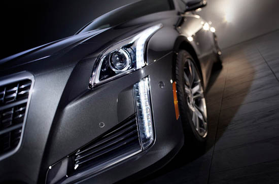
This already looks really, really good. Even though it adopts the German “Same design/different sizes” strategy. So it basically looks now like a big ATS.Which is just fine.
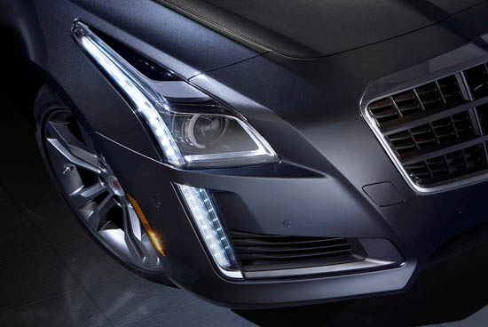
Although, just like in the ATS, the grille could be a bit more original and better integrated to the rest of the car…
But the whole thing seems quite aggressive. And the interior, again similar to the ATS, looks to be a giant step forward when compared to the current, aging, CTS interior.
It will also be a bit larger and more expensive, as it now competes with the BMW 5 series…
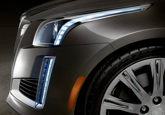
I'm absolutely speechless vince, I'm happy to see the 4-door convertible concept had a heavy influence on this, I love the unapologetic grill. What especially makes this car powerful is the beltline that the headlamp rests on is high up, the headlamps themselves follow the thinner-trends but with a twist… they vertically thin, something I haven't really see anyone do. And the the contouring of the hood, as well as that piece of embossed space between the grill the headlamps really give this car some authority and masculinity.
I guess they are trying to win "who has the most LEDs on the front" award. Watch out M-B and Audi!!
Keep in mind because of European pedestrian collision laws, that limits what can be done with the front end, specifically the grill.
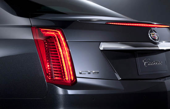
The Ciel-esque front is dazzling; the rear comparatively bland. Had been afraid Cadillac was going to round-out (i.e., dumb-down) the Art and Science lines for broader brand appeal in China, and am glad this is not the case. Leave the curviness to Buick and let the Caddy look live!
The front end is very handsome in these pics but the rear looks terribly dowdy, like it's more in line with the (discontinued) DeVille than any of Cadillac's newest designs.
We'll see how it all looks soon enough…
Front looks great! ABOUT TIME!!!!! The rear is underwhelming. The interior is its weakest area. But I wont mind seeing these on the road as I zip by them.
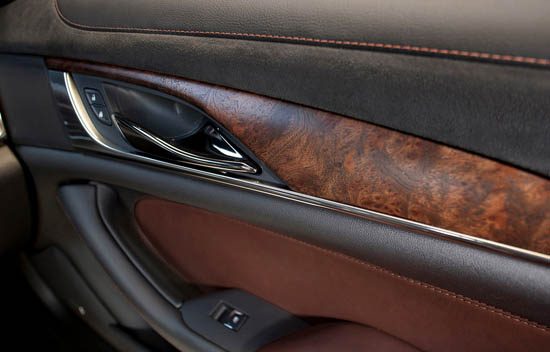
Rear seems to have a slight boattail like the '78 LeBARON Coupe, Chrysler Atlantic, '71-77 Grand Prix; which is a GOOD Thing! Front Vertical LED's are genius! Door interior panels are "best in class". Much Much better than I was expecting from GM. Definitely puts BMW/MB/Audi/Jag to shame!
What is wrong with GM? They screwed up the tail lights from the get go. Why are they stuck with the same design in this round? It makes the car look middle aged…for old farts.
The problem with the previous CTS (and this new one too by the looks of it) is that it's a fairly mediocre car that tries really hard to be "premium."
That means that you get some wood and some stitching that a GM exec once saw in a Jaguar, but also the same old p/w switches as in a Cruze, and a chassis that's not sporty or luxurious.
Then they release some embarrassing ads that try to convince us that it's "as good as a 5 Series" because it has similar features. Just like that girl at the Quicky Mart who looks sort of like Mila Kunis…
I don't see how Cadillac will ever get its mojo back when all they do is copy off-of everyone else.