Just when you thought it couldn’t get uglier: 2014 Toyota 4 Runner
Last Updated:
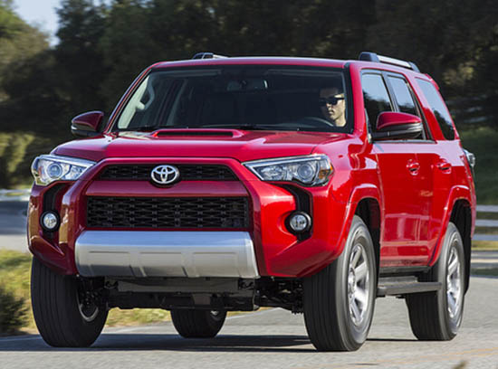
I mean really. Look at the front end!
It looks like a bad photoshop from a 12 year old. I don’t really know what to say. It’s quite amazing.
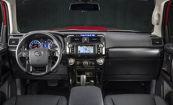
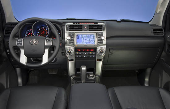
Inside it looks like the cheapo fake metal trim was replaced by glossy black plastic. Which is an improvement. Let’s hope this is a new trend at Toyota/Lexus.
Otherwise, no changes.
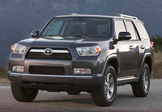
This is what the current one looks like.
I always thought it was really ugly until today…
That IS the single most Repugnant Automotive Atrocity I've Have Ever Seen.. WOW!
Lost in "recall "space
Oh good lord, this is a nightmare. Thanks Toyota, I just got whiskey up my nose at the site of this thing. Other than "WTF is going on at Toyota?," no further words are necessary to describe this.
That's pretty aggressive for Toyota.. looks like they're trying to link it visually to the FJ Cruiser and play up its off-road prowess.. too bad 90% of them are sold to soccer moms who rarely leave the mall parking lot.
Those gaping openings are just asking for a stubborn branch or object to rip the entire front fascia off. Just sayin…
It makes new Subaru Forester look glamorous!
I don't like Toyotas, but I have always liked the 4Runner. Glad to see they didn't beat it with the CUV stick.
The 4 Runner has always been the choice vehicle for men questioning their sexuality. This newly tweaked version probably won't change anything.
Same designer as the new Cherokee and Forester? The future is starting to scare me….
The Pontiac Aztek was almost nicer that that…
"too bad 90% of them are sold to soccer moms"
You are right. These should be used as intended: gun ships for militias in Mogadishu.
And the E class should only ever be sold to taxi drivers in Cold War Vienna (later to be recycled as intercity taxis running out of Tangiers).
And Corvettes should only ever be sold to people who "accidentally" pick up transvestites.
I love these automotive clichés, they are so much easier than thinking.
Ho, ho, horrendous!
Why?
It's a mutated alien from Predator!
I've to say it looks futuristic.
I truly don't understand Japanese design anymore….Toyota design has alway been uninspiring but this is just horrendous!
I post some of the snarkiest comments on here. I have to say- Even though it's ugly, there something strangely satisfying about it. It says: "Drive me and crash me hard into a dune."
I believe we're into a period in the car world where people are actually wanting to be shocked and awed with gaping surfaces, adventurous lines and scoops.. Vulgarity basically. Just looks at the crap that's on TV. It's a reflection of our cultural rot and what we accept as what is desirable.
I love the front end. Its where the truck market is right now, bold and agressive. Toyota is tired of being called vanilla. But looks are subjective, so haters gon hate.
But Vince, you're way off on the interior. It is not just different colored trim, but it has several improvements in layout, features and quality. This was no rush job. It's actually become quite an inviting place to be.
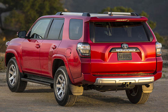
This is what they get from recyclying the same mold from the Rav4 tail lights. Just when I thought it Toyota hit the limit of Ugly. This thing is HID-E-OUS! But still looks better than the Melted Cherokee.
These SUVs are going to be illegal in the next few years so the best way to kill demand for them is to make them increasingly ugly. Jeep Cherokee and now Toyota.
Although this does not have a trim logo, this is the Sport Edition, note the hood vent that the sport model has carried across the last three generations. I think that this car is much improved over the last FJ-esque Sport Edition.
Let's just hope the SR5 & Limited look a little classier.
Toyota has the same strategy with their Tacoma…Make it so stupid looking that everyone gets turned off and buys a Tunda. That aint working to well for them. Small footprint trucks are going to be illegal in a few years as well which is why Ford did away with the Ranger.
I think we need to give credit to Toyota for finally trying to step out of their bland designs. Only problem is that they jumped from the bland line to the hideous one. After seeing this I love my 2013 Pathfinder even more!
Toyota truely shows as a lost company in all they do..
Blech.
I'm quite amused at many of the comments in support of this metalized turd. Never thought I would agree that even the abomination that was the Aztec is now better looking than this for-trolls only crapper on wheels!
How can anyone be proud of owning a 2013 Pathfinder? As ugly as this may be, at least it hasn't turned into a station wagon.. yet.
This is the best you get when the Japanese try to do "Manly". Seriously…This is their idea of manly.