Finally the real thing: 2014 mercedes S-Class
Last Updated:
Here it is. Real and better pictures of the all new big Mercedes sedan.
Which is pretty bland and to me, doesn’t look more modern than the current one. Which I always liked.
Remember when the S-Class would stand out because it looks so modern and different?
Like the 1st one actually called the S Class. That came out in 1972.
You can still see many of them around. And many were used as “rich bad guys” cars in 70’s TV shows.
That car looked so modern and different than what came before it.
Not anymore….

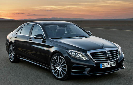
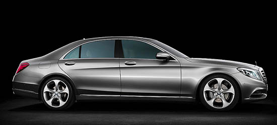
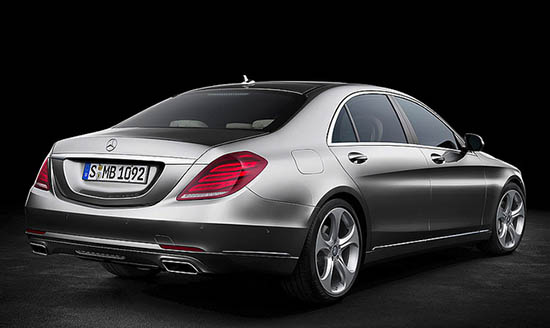
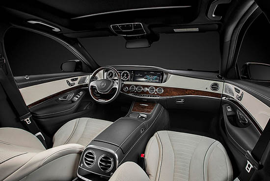
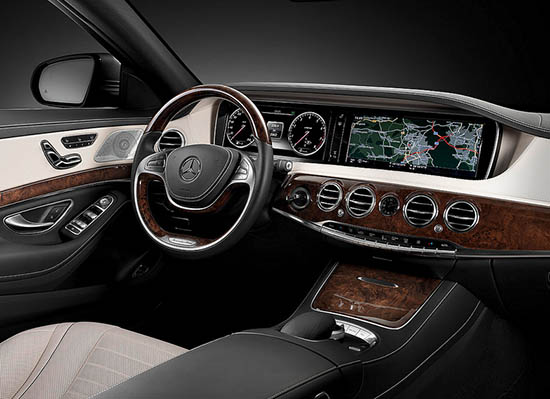
It's not as ham-fisted as the previous version but it's still a mess. That trendy diving-undercut that BMW abandoned is way too severe, the lights trying way too hard to be busy and techy-looking. That interior.. OMG… Sure it's lavish, but I think the overall effect is cheapish and kinda silly. That steering wheel is straight from a little tikes pedal-car. I wish they'd focus on being Germanic and develop a form language that hearkens to their past successes and simplify rather than adopting this rounded-turd profile that they're squeezing out nowadays. Good try though MBZ, I'm glad you're improving.
Very, very disappointing exterior design, as it looks like little more than the old model minus the 1st generation Ford Focus fender flares with a Maybach rear-end grafted on.
The interior certainly looks more interesting though the dash does contain a few too many completely unrelated shapes/forms to ever be consider cohesive, and the two LCD touchscreens shouldn't look like someone just plopped two tablets in the dash and called it a day – as they do here.
Oh Well… Less attractive vehicles have sold well in the past.
Front seat is nice–back seat is stupid. Exterior lacks imagination–or style. Overall it's a fail.
I have to laugh- I recall reading a Mercedes S-class ad from the 80's in one of the popular car magazines. There was a quote from Bruno Sacco that read:
"Good design is knowing what to leave out."
The exterior is handsome, but not at all classic in either proportion or line.
The interior is lavish, but crass. The wheel and dash are particularly bad. Who approved the ersatz Rolls-Royce air-vents?
The current (now old) model is aging very well. I don't think this one will.
Underwhelming exterior, particularly from the rear 3/4 view. It almost looks like it is wearing a dress. Very weak and feminine design. The 2-spoke steering wheel is especially hideous. Germans just can't seem to design an attractive large sedan anymore.
This is what the Tesla dash should look like. Technology is present but not overtaking the dash like kudzu.
OK, who is driving these cars? Rich guys with a low self esteem problem? The interior shot looks dreadful. The exterior I do not mind. Overall, I would say above average.
That rear seat shot has the front seat moved all the way up, who are they kidding? Otherwise I don't think it looks so bad. I'm happy the Nissan Altima headlights are finally gone….was not a fan of that. These speak to their current design language with a little of the early 2000s model mixed in.