2014 Chevrolet Malibu
Last Updated:
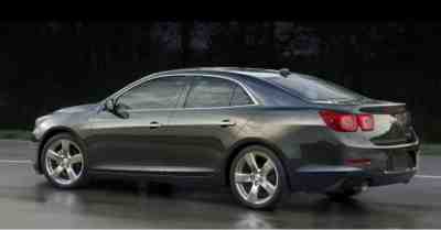
It looks like most of the changes are up front. The rear of the car looks the same to me…
The new front looks a bit more aggressive. And not as bland as the new Impala.
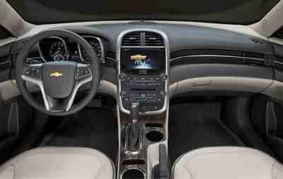
Inside, it’s hard to say. The wood trim seems a bit more realistic.
Chevy's corporate steering wheel is horrible and would keep me from buying any of their cars. Why do they mess up the one part of the car that the driver interacts with the most?
Not enough of a change to make a big difference. Good, but not good enough. The Accord and Mazda6 look miles ahead of this (yawn) thing. I guess if you really want one all you will have to do is visit Avis.
It should have probably been like that when they launched it. I'm slowly getting used to it. It is bolder than the previous one and somewhat inspired from the 2008 Malibu.
Yet, I'm wondering where is Chevy going with that style and the half-dozen styles they have for their cars…
Yeah, put a bigger grill on it. thats gonna move it off the lots… /sarcasm
The problem with the Malibu is that GM really wants you to buy a Regal or a Verano.
That leaves the Malibu for the "you can't get a cheaper car" crowd, and those people can get much better value from Kia and Hyundai.
I'm not sure that a mild facelift will help, but I am 100% sure that nobody shopping for a Malibu wants to pay extra for a Turbo. If they had more money, wouldn't they be in a Buick or Honda dealership?
Okay.
They didn't fix the things I didn't like about it: the taillights and the dashboard. Who designs an interior based on the shape of air vents?!
The front does look cooler, but the front was never the problem. The problem is the back end and the interior. IMO the interior should have had a complete redesign and the exterior should have been left alone but that's because I really hate that interior design–it looks so old. I wish they had taken the interior from the last gen. and just improved it.
THE problem with the Malibu is GM. They had a success on their hands with the previous Malibu. So when it was time for a new model, instead of evolving on the success, they reinvented the car. Dumb. oops the car looks bloated and dated. I prefer the side profile of this new one, but that's it. Stupid GM.
Unbelievable comments from the peanut gallery. In a world of BORING sedans from Toyota and Honda, people are being critical of this? And to think…"I wouldn't buy the car because of the steering wheel". Do people really believe what they say?
The updates make the car look expensive and much more aggressive. It's attractive without being over done. Put next to a Camry and the Malibu will look like a Maserati. Get with the program people! It's a good looking car!
People need to clean their glasses. This car is considerably better looking than an Accord, Sonata or Altima. Not as sexy as the Fusion or the Optima. But in the sea or bland sedans, this is a beauty queen.
The problem was never the style of the Malibu. It was the drivetrain. The Malibu was launched with feeble engine and transmission combinations.
Dang! The rip roar against what is a well designed exterior and a very decent interior for a family sedan.
Sure, some have a problem with the rear tail lights but other than that, having seen this car in person and test driven it, I don't see how anyone can make moronish comments about the car being inferior to a Camry or Accord.
Mind over matter folks. Overall, this is a good family car and is priced competitively.
Out of all the Chevrolet like up the styling of the Malibu is the car that works. There were lessons learned regarding the influence of the European GM, Saturn and Opel however it gets muddy in the process.
I rented one I belive it was a ltz, I loved it. Kept it for a week.