2014 Honda Fit
Last Updated:
I don’t know where to start. What a disaster…
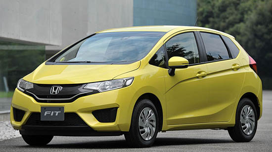
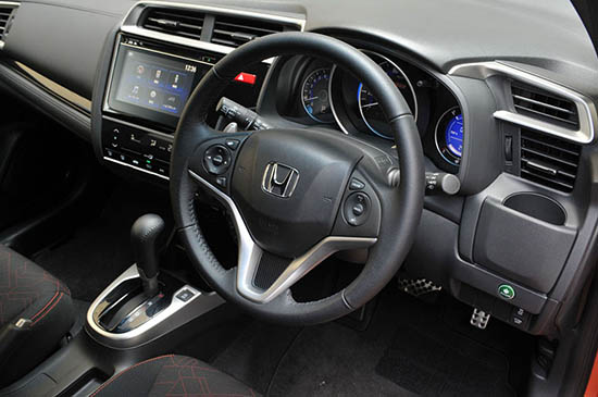
These new pictures of the redesigned Fit still show a horrible design. How many lines can you squeeze in a small car? And the interior also looks like about 35 designers worked on it while never talking to each other.
This is so much worse than the current model.
Sedan and SUV versions will follow soon. All built in Mexico for the North American market.
This makes the new Nissan Note look like a movie star.
I like the Versa Note better, less chopped up. Both Nice though
I just don't get why that character line dives down in the front. It doesn't seem to relate to anything else on the car – like they started from the back and then someone's pen slipped right at the forward finishing point. Without that slant, the rest of the side is ok.
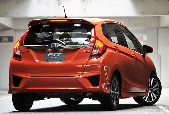
Let's not talk about the rear…
"How many lines can you squeeze in a small car?"
No freaking kidding. Do they have some of the same "design assisting" substances that Lexucks uses?
That cup holder in the dash might be a good idea, except that it's got TWO vents above it to blow dirt (or worse) into whatever is put there. Duh…
The lower front fascia is bad, and the rear bumper, but the rest of the car doesn't look that bad considering its proportions and what Honda/Acura have been doing lately. I certainly wouldn't mind one.
Draw a car is like write a book or a music composition: One good idea from the front to the end, declinated with harmony and proportion in few variations. The italian designer are "maestro" in this kind of things. I love Honda, but this design is cacophony (group of noises together without harmony) Come on HONDA!, we want nice cloth to dress your technology. The old FIT-JAZZ was a really nice design!
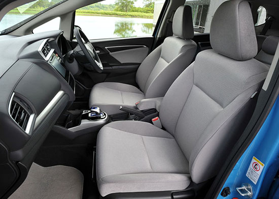
So many people deride the fluid form of the current Fit. To my eyes, it is a sweeping well integrated design that could have been updated significantly to give a better result than this vehicle. While I like some of the changes – particularly the seats and interior – like everything Honda these days, it suffers from some form of complete discontinuity across the design. Pictures give a different impression than sheetmetal but to my eyes this will be highly misunderstood by the potential buyers. Its just bad design integration.
Love your honesty in your commentary. "What a disaster" is spot on. Too bad, because the car probably drives great.