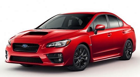
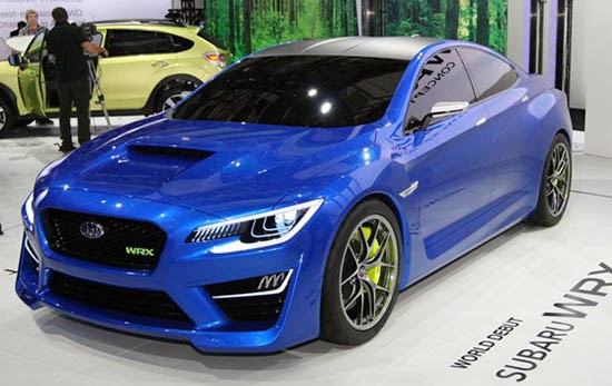
2014/15 Subaru WRX
Last Updated:
If this is the real thing, the next WRX will look like a crappy car from the 80’s.
I mean this is really bad. No matter how great the WRX drives, it should look better than this.
There is really no excuse for a car looking that bad in 2014…
This is the concept from last year. Nothing futuristic mind you. Just a nice design with really good proportions.
What the hell happened in just a year???
Jesus Christ that thing is ugly. That shelving unit grafted onto the front end really adds a certain something..
If that's the real thing, it has definitely pulled an Aztek. As with that vehicle, the concept had some good points, and you could see where details from the show car made it onto the production model, but something went horribly wrong along the way.
The red car looks like a Bizarro World version of the blue.
Disgusting toyota style
I wouldn't call the design "ugly." But it sure is conventional and ordinary. Like a Corolla or Camry. So, in that sense, it is ugly by virtue of the fact that it's a lazy effort. And unlike Toyota, we know Subaru can do better.
It looks like ass.
Subaru is hopeless. Even Acura is improving…
While the concept version looks like it might be from 2015, the production version looks more like a car from 1988… seems like it would have been easy to produce the concept version, but instead they decided to go back in time nearly 3 decades.
In a world where Buicks look better than Subarus….WoW.
– FusioptimaSX
"It looks like ass."
I don't know,…. I kinda like ass. This WRX/Impreza… not so much.
Definitely a missed opportunity. Why does this happen? Do automakers deliberately decide to water down good designs? I never thought that such a low roofline would make it to production. That wouldn't work for a number of reasons. But the shape of the grille, the placement of the logo, the shape of the fog lamps, the color of the roof or side mirrors have nothing to do with safety compliance or drag coefficient. So why do they decide to make something that isn't awesome?
I don't think that the design is horrible. But it certainly is boring and underwhelming.
I think it's more than a missed opportunity- It was obvious that when the new un-impreza was introduced, the WRX version would be shit. You can't make proportions like that look good. I wish Subaru would hire some outside help. Sure worked for the Koreans..
The back half looks like a smaller, melted Subaru Legacy sedan………FAIL.