2015 Ford Mustang
Last Updated:
These are really bad pictures, I know.
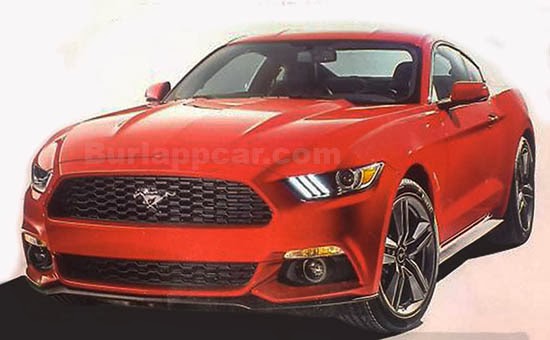
But this is it, the all new Mustang.
I must say I am, so far, really disappointed. It just looks like they tried really hard to make the old (current) design fit the new chassis. There is nothing new at all. Anywhere.
Some elements, like the 3 LED bars next to the headlights, don’t fit the design at all.
And they look cheap.
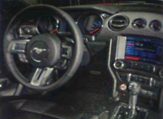
Inside, they updated the Sync with too many dials and buttons! Everybody told them to bring dials back so they went overboard.
So far, this is so bad… Neither retro or modern.
BUT. I am still seeing the real thing in a couple of days, and might just be changing my mind after sitting in one. Who knows…


"So far, this is so bad… Neither retro or modern." Gee Vince – it's a good thing you don't do movie reviews – you'd form your opinions from the commercials before actually seeing the film.
You are absolutely right…
I was just kind of bummed out when I saw the pix…
I really want to like it. I still think the 2005 was one of the best. (After all the years of crap). It was truly an all new design. Simple and clean.
Let's hope tho spooks better in person.
I will report on Thursday and really try to be objective.
No need of an all new design. A good évolution of the current one could be ok ! But so far, i don't like it…
Spot on, really boring. Almost looks like it should be 2004 again.
It looks depressed in this front end shot (the oversized grill phase can't end soon enough for me). The side view pic that I saw made it look like the Encore's little brother–just proportioned weird. Inside, I would've liked to have seen more emphasis on the steering wheel and instrument panel (more of a driver's car), with less emphasis on technology that will be out of date in a few years. This would've been a great candidate for a pop-up nav screen. Oh well. I'm sure there will be some high performance versions that will be more to everyone's liking.
i actually think it looks great and this coming from a guy that wouldnt buy american
Kelly!
Jill!
Sabrina!
…your Mustang III is ready.
Alright, I am willing to hold out until Thursday, December 5th, reveal day, before casting final judgment.
Gotta say though my initial impressions are not positive but like Vince said, he could change his mind as like the rest of us could?
I hope it doesn't look anything like this.
With any luck, this "leaked" image isn't the actual car. It shares too many similarities with the mid 90s Mustang.
its an evolution of the current design. also… keep in mind this car has to cater to the WORLD now. no u.s. muscle car anymore.
It amazes me that so many people expected more. Remember where the entry price point for this car sits. It is not an exotic, but will be updated with at least 2 new engines, finally has an IRS, and has tastefully evolved. No, it is not a clean sheet design. My criticism of American cars has been that they seem to do a needless and costly re-invent too often.
I'm not sure….this is a crap photo and I think we might be pleasantly surprised when we see it in the metal. It's evolutionary for sure but isn't that Mustang heads want?
The 3 bars in the headlights look great and distinctive! Basically you'll know it's a mustang from a considerable distance away. No one besides Audi has really had a distinguishable LED pattern.
Also, think of it this way, we could have gotten a 5th generation Probe instead if the Mustang were killed off. But I think, even if it were, it would have been revived by now.
-FusioptimaSX