All new 2015 Mercedes C-Class
Last Updated:
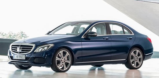
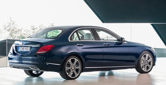
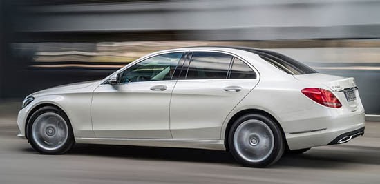
Finally, official pictures.
I think it looks great, It is closer to the S Class than ever, and seems to really work on the smaller scale.
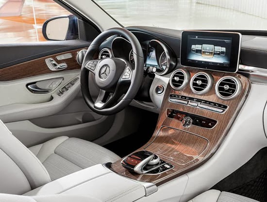
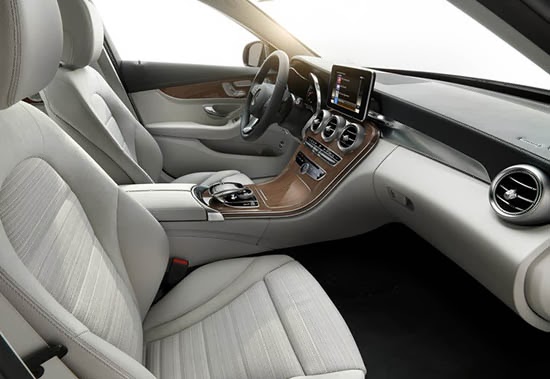
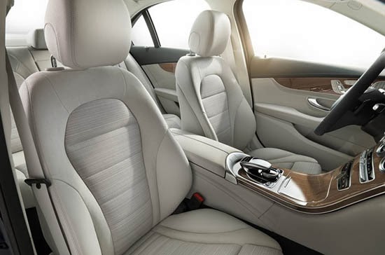
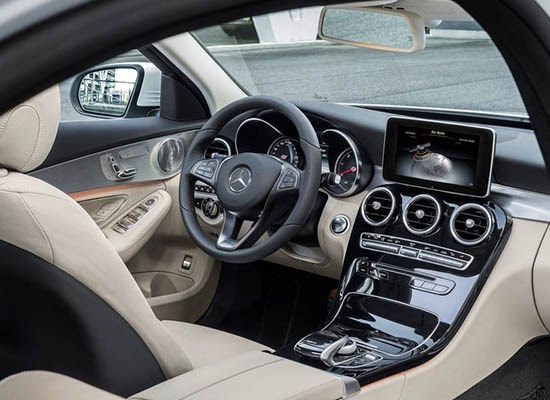
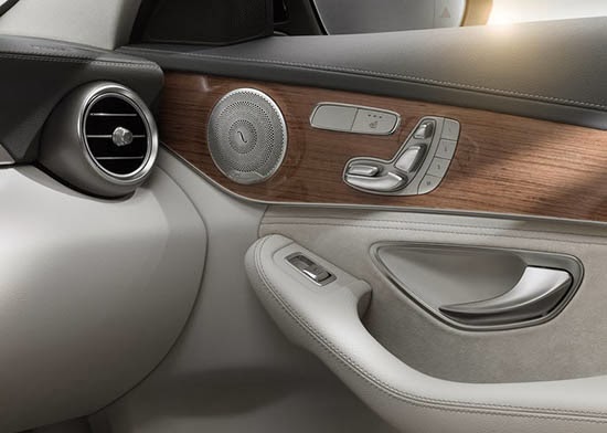
And the interior is quite amazing. With original shapes and textures.
At leas tin pictures, it seems a class or two ahead of the competition.
The engine line up for the US should include a 4 and 6 cylinder engines.
But they are also offering an all new Diesel Hybrid option (At least in Europe).
The C300 BlueTEC HYBRID includes a 204HP Diesel engine and a 27HP electric motor.
Another plug-in Hybrid model will also be offered later.
Man, that interior is fantastic! The exterior, however, reminds me a little too much of the old Jaguar S-Type…or even the old Infiniti J30…not so good. definitely not sporty.
I see a lot of Infiniti G/Q lines here. No?
The interior is definitely an upgrade from the current line… The exterior? (… yawn)
Their use of wood is awesome. The interior is simple, but beautiful. I wish more automakers could restrain themselves.
The soft oozy exterior is very dated. If it weren't for the LED lighting treatment, this design could pass for a Hyundai from 1992. It is awkward and clumsy in 2014.
I think the interior is a huge step up for Mercedes, aside from the Garmin tacked onto the dash. I never understood why audi has a screen retract out of sight when it's something you use constantly. But if this is the alternative, I understand why audi does it.
Is that a cloth interior? I've always liked a cloth interior.. tis not too hot in the summer or not too cold in the winter, and it grips the body better for aggressive cornering. Plus, it breathes better for better comfort. A nice plush cloth interior is way better than fake pleather any day.
I see they took a page out of the Chrysler/Dodge playbook with the cloth inset/leather surround seats– And that's a GOOD THING! The exterior is a puffy imitation of the new S (which is about the LAST exterior I would want to copy). The interior, on the other hand, is drop-dead gorgeous! Excellent use of wood & metal. Hey BMW 3-series; WAKE UP!!!
Ok.
I wish the rear of this car wasn't so soft and feminine. But there's a lot to like about this car. I do like how Merc has softened the shapes of the interior. I felt that their interior design had taken a step backwards when they starter to embrace those straight-edged designs in the early-to-mid 2000s.
Well, I guess seeing the S and now the C takes away any imagination about what the next E might look like.