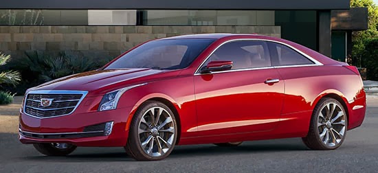
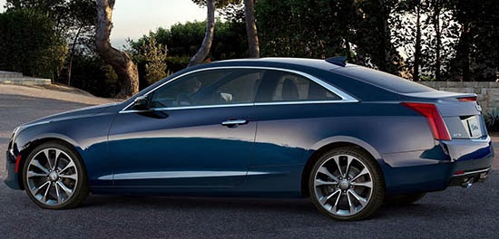
2015 Cadillac ATS Coupe

Last Updated:

cadillac ats atscoupe coupe 2015ats

cadillac ats atscoupe coupe 2015ats

Finally, the real thing.

It is everything that was excepted, and nothing more.

I guess the ATS sedan is not an exiting looking car and I was expecting a bit more from the coupe. Something more than a 2 door sedan.

Still, there seem to be nothing really wrong here. Well proportioned, classic… I guess.

Looks like the new Cadillac logo is used for the 1st time.

The base 2.5 Liter from the sedan is not available on the coupe.
The choices are the 2.0 Liter Turbo and the 3.6 Liter V6. (As it should be)
A 6 speed manual is still available with the 2.0 Liter engine.

Wheelbase is the same as the sedan, so it could be quite roomy for a 2 door car.

Conversation 10 comments

  1. You know coupe buyers… always lusting after safe designs… never wanting to actually stand out in a crowd. No sir.

    And that badge… ridiculous. Like something I would've worn on my Underoos as a kid.

    Other than set Cadillac back in my mind, this car changes nothing. It's totally forgettable.

    Cadllac, you are not Mercedes. You are not BMW, You are not Audi. You are not Lexus. Find your own playbook. Lead.

  2. i cant see how this will sell… it looks too boring and conservative.

    anything else looks way better.
    this is something we call a "rentner-auto" in germany, saying it will be mostly driven by retired persons. looolz

  3. Let's see. It's not sporty, it's not all that luxurious, it's not prestigious, it's not elegant, it's not impressive.

    Overall, it's just a "so what?" Cadillac coupe. The kind of thing you lease if you can't afford the payments on a 4 Series or a C-Class Coupe or an A5.

    Cadillac Coupes should be big and badass and expensive. This thing is meek and self-effacing.

  4. Hopefully not just playing devils advocate here but I think this might be a wait and see car. I think the proportions and elegant roofline/DLO will look a lot better in person

  5. The good: I like how they glassed-over the B-pillar. The bad: Everything else. Man, this is SO dull. I realize the CTS coupe was probably a bit extreme, but this just looks like a 2-door version of a 4-door car. Not at all interesting or compelling.

    ALSO, I HATE the wreathless crest. Hated it on the concept, and hoped against hope they wouldn't go with it. It looks all stretched, distorted and trendy, and loses the presence that the previous one had. As the only circular element on a line of angular cars. It really stood out as a focal point. This one just gets lost.

  6. Hmm.. what to say about this? Between the front and rear wheels, the accent lines are great, clean, with nice proportion of glass-to-door. The previous CTS coupe was all door – bad! But the front and particularly the rear views are… I'm not even sure bland is the right word. They're almost throwbacks to the old (retiree) Cadillac. With such clean body proportions, it almost beds to have a cleaner (grill and lights) set up that is at the same time more dramatic…. like the new CTS. And the rear just says "cadillac fleetwood" to me. Its underwhelming and very 1990's. Lastly, the wheels and tires look WAY TOO SMALL on this coupe. I hope Cadillac sees the problems and moves to correct them quickly… they're fixable. Ok, now the last thing: I dont think in its present form this car is a 3/4-series rival. But if they sell this year's allotment to retires, it hurts the brand image. They should look at how Mercedes has positioned two front/rear looks depending upon the trim type: luxury and sport. That might help salvage this AND allow the addition some Cadillac concept flair like the El Miraj (to the luxury form). Good luck Caddy !

  7. I think this is a solid look, with the exception of that Grill. The Logo without the Wreath just looks out of place. If they used the grille from the Elmiraj, it would have looked much better. However, the logo looks great on the rear.

    -FusioptimaSX

  8. It's a conservatively handsome luxury coupe which is appropriate for its segment. It's not like the BMW 4-Series or Audi A5 are progressive or ground breaking designs.

    I am probably one of the few people who miss the wreath around the Cadillac crest.

Leave a comment

Your email address will not be published. Required fields are marked *