Volvo XC90 Interior

Last Updated:

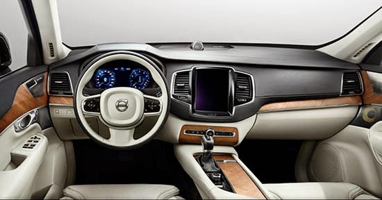
Volvo has been teasing us with the all new XC90 for so long now…

But today we finally get to see the real thing. Inside.
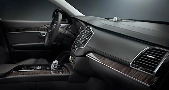
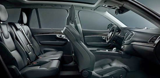
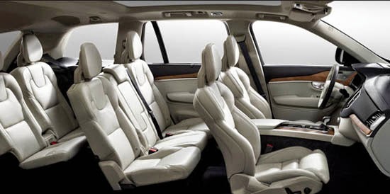
And it does look quite impressive.

Although, for my taste, there seem to be a lot of shapes. The center screen with the vents on each sides looks like it doesn’t really belong there. Or it could just be something else.
Still, the whole think looks really upscale.
Now that Volvo and Mercedes are coming up with great interiors, the ones from BMW really seem old…

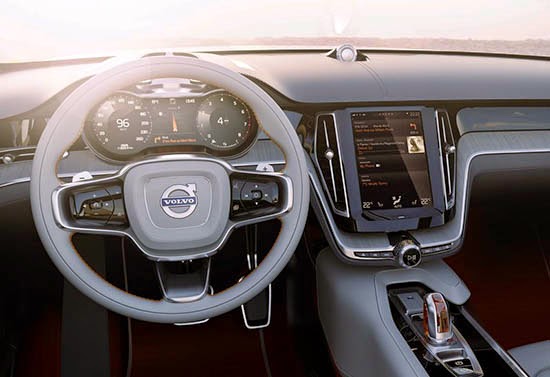
I was actually hoping for something more like this. The interior from the XC Concept we saw just a while ago.
It seems a lot simpler, modern and original. 
Why didn’t they just do this???

Conversation 13 comments

  1. Vince, I could not agree more, point for point. Looks luxurious, but odd shapes don't seem to come together in pics, and lacking in any Volvo-ness…

  2. Also, I miss the graphic of the human body for climate control and the floating console panel -both Volvo originals – both seemingly abandoned. Disappointing.

  3. I don't mind the shape of the screen at all, in fact I think it's very smart. It's just, the concept below it looks so very much better. The production shots look like something I would have expected from Chrysler of a few years ago, or Kia. I'm not impressed.

  4. I like it, but I fear that what actually shows up in dealerships will be in the typical dreadful Volvo grey-on-grey. Let's wait and see.

  5. Looks heavy and somewhat dated. I agree they should not have abandoned the body graphic climate control and the simple modern look in their current designs. An evolution of the current designs or something like the concept would have been better.

  6. There are three reasons why the new XC90 interior looks like this and not like the XC Concept's:
    1. The Chinese market.
    2. The Chinese market.
    3. The Chinese market.
    Volvo's not going to be selling a ton of cars in the U.S. any time soon and they're maxed out in Europe growth-wise, so they're counting on China to fuel their sales increases. A lot like Buick, if you think about it.

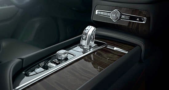
  7. The attention to material quality and detailing appears to be very very good. I really like the line that goes across the dash and sweeps under the infotainment screen to incorporate switchgear. The gauges area great, as is the area around the gear shift.

    I'm not loving the steering wheel design or the infotainment shape. It looks like they inserted an iPad mini. But overall, the design looks like they have potentially matched Range Rover and Audi for interior material design, if not quality.

    As much as I love Volvo, I won't be buying a Geely vehicle anytime soon. I'm not convinced that they engineer good vehicles yet, and I send enough money to China already.

  8. They have somehow managed to make quality materials look terrible. It's just such a clunky, heavy design, especially when viewed from the passenger side, with all those weird seams and shapes in the center stack and console area. What happened to the "floating" feel with thinner surfaces and a feeling of airiness that they were doing so well previously? This could not be more opposite, and definitely does not suggest the cleanliness that Scandinavian design is know for.

  9. It's really pretty sad. Volvo used to be such an interesting, quirky, neat car with a very loyal following in certain parts of the US. Then Ford bought it and tried to make into their own BMW and basically killed it. And now the Chinese are finishing the job. The interior looks like something out of a Lincoln. I don't know what it is, but it's definitely not "Volvo." So sad that all cars these days have to mimic each other and look alike. Apparently all of the original ideas in carmaking are gone.

  10. Best-looking interior Volvo has EVER done. Unfortunately the quality and safety will not be up to the standards they were when Ford oversaw the engineering.

  11. It's not unique like Volvo's have been. The shape of the vents reminds me too much of the Grand Cherokee.

    https://www.jeep.com/

    They need to be redesigned. And the controls should have been integrated with the screen as in the concept or as a floating element of the center console (as is a theme in the current models) instead of floating below all by themselves in a sea of tan leather.

Leave a comment

Your email address will not be published. Required fields are marked *