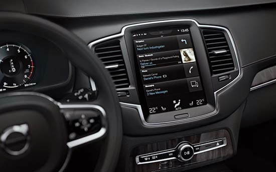
2015 Volvo XC90 Interior
Last Updated:
It does look luxurious enough on these well lit pictures.
And I am all for the upright display, which makes a lot of sense. Since it feels like a phone, something we are all using every day.
But I am really not fan of replacing the dials with another screen. I know this is a trend that will probably take over every car soon. Which is too bad.
(I guess if we don’t like it we”ll just have to buy used cars…)
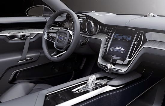
No matter how nice the new XC90 interior looks like, THIS is what they have been showing us in 3 different concepts over the past 2 years: a great interior.
So much better. It makes the production version so bland and boring. Even old!
This was very special and original without being too far-fetched.
What the hell happened????
The concept interior is classy. The actual production version looks very low rent with the bizarre Chevy Emblem profile.
Well smartphone is upright since you can hold it easier that way.
Widescreen is better for most apps especially nav except for reading articles which you don't do in a car (I hope).
Bit austere and too dark looking for my taste but anything better than they have now.
a 260 mph speedometer??? In an SUV that will NEVER go over 90 MPH??? Who are they kidding?
^ That's KPH
Why did they change it from the concept? There were some really attractive design elements before. It still looks good. Probably because it's been successfully done already by Jeep. It's strikingly similar to the very sharp looking Grand Cherokee.
I knew the Chinesieness would show up at Volvo eventually. They can't help but to copy someone else.
Elegant, understated and simply beautiful. Love it!! Very lux looking 🙂