Buick Envision Interior

Last Updated:

From what we saw earlier, the new Envision seems pretty conservative and quite generic outside.
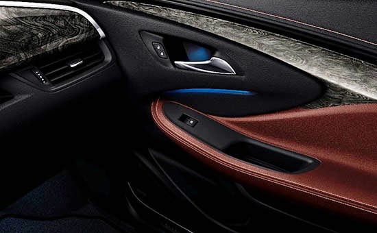
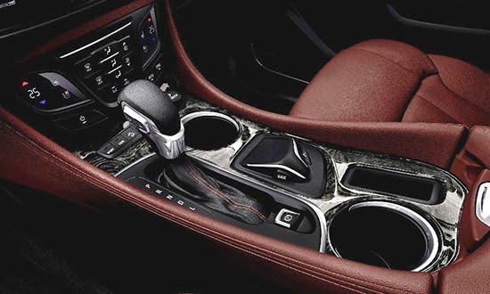
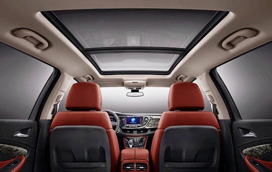
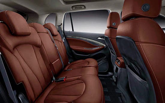
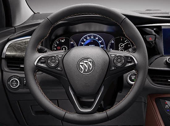
At least on these pictures, the interior seems a bit more original.

These are actually pretty bad photos, so it is hard to say. (Also that red/black combo isn’t for everyone)
It could be a case of “trying too hard”.
Not sure about pricing, but being cheaper than the $36 500 Enclave, it could be competing with the new $34 000 Lincoln MKC. (Which is really, really nice in person…)

Conversation 7 comments

  1. Yikes. Red/brown leather with blue accent lighting? No thanks. Also the slab of wood on the dash in front of the passenger is huge.

  2. "trying too hard"

    Please. If it were a Hyundai, you'd be swooning.

    But I do question the woodgrain. If it's fake, which it most certainly is because it's a Buick, then there's way too much of it.

  3. You guys are right, the wood on the doors and the blue accent lighting is terribly tacky, as are the colors they've used.

  4. in the official photos the colors look a lot better. Vince you should update your photos cuz its not really that red.

  5. LOVE the wood. But wish it were lighter color; like Birdseye maple clearcoat–like my T&C limited. I have black stained real wood in my 530 xi and it's not as appealing as the lite maple.

  6. LOVE the wood. But wish it were lighter color; like Birdseye maple clearcoat–like my T&C limited. I have black stained real wood in my 530 xi and it's not as appealing as the lite maple.

  7. The hazards button is placed in a horrible location, just like the Cobalt, you can't see it sitting in the driver's seat because it will be hidden by the steering wheel. It should be more towards the center of the dash.

    -FusioptimaSX

Leave a comment

Your email address will not be published. Required fields are marked *