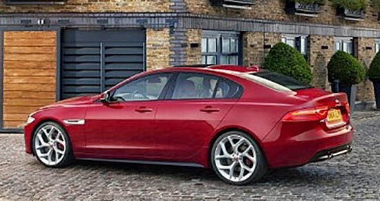
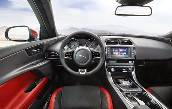
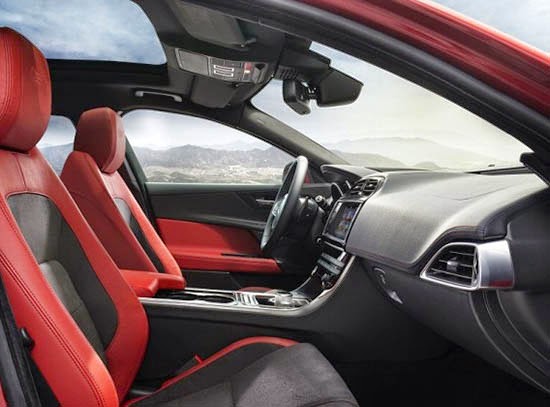
More pix of the all new 2016 Jaguar XE
Last Updated:
Still needs to see the regular version.
Red interior is just pretty horrible.
And it doesn’t seem that upscale, at least on the pix. There is something cheap looking about the door trim…
And also. That great looking sunroof! It’s actually useless for the driver and front passenger.
Look how far back it starts. Why?? Why?????
And now we know that it won’t even come to the us before 2016!
Again, why????
Wow. What a bore. I have the feeling they'll need incentives shortly after release.
I think it's okay at best (and hardly worth proving I'm not a robot). I mean, overall it's good, fairly handsome, tasteful and all that, with a couple exceptions I don't think I need to get into. But does the XF–which this is obviously derived from–not date back to 2008? They think that's going to still work in 2020 or so?
I've given it some thought and I've come up with the perfect slogan for Jaguar: Overhype and Underdeliver.
I'm honestly depressed now. 🙁
Coudn't agree with you more about the interior. It looks awkward, cheap and straight out of a car built 2 decades ago. Yuck.
The sides look like a G8, and that rear is definately dated do whenever the XF was penned as mentioned before. I really don't see anything moving or exciting about this car. It would have been passable…in 2008.