Cadillac CT6
Last Updated:
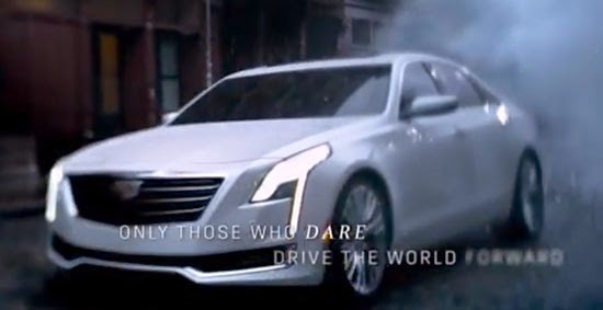
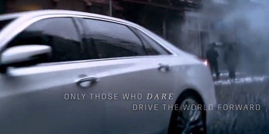
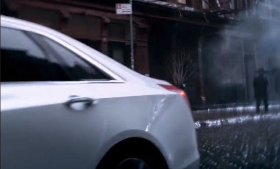
These are taken from the all new Cadillac commercial that aired during the Oscars.
A new one, where they finally show one of their cars. (Also, the one with a weird choice of an old Edith Piaf song)
And that car is the all new top of the line CT6.
Which should be competing with the Lexus LS, Audi A8. And I am sure they would like to mention the Mercedes S Class and BMW 7 series.
At first, it kind of looks like a somewhat simpler CTS, but as you can see from the profile, it is not.
Now that they have shown it, we should know more about the car very soon.
Which could be quite interesting as it is rumored to be powered by a Plug-in Hybrid V6 power train .
Does it look like what a “big Cadillac” should be?
Here is the whole thing.
I must say, I still think this is quite an obnoxious commercial.
The title, “no regrets”. And that song saying over and over “I don’t regret anything”.
“no regrets”. Really? No regrets??? At all??? Nothing?
Not even the Cimarron?
I'm really curious as to why the front end styling is so different from the two concepts we have been teased with? The lower lip really looks like something from a VW or Audi. There are non of the sexy curves from the concepts. Is this Johan de Nysschen, lifting his leg on what was greatly anticipated to be the return of American Style? The front end styling has been really dumbed down it is not exciting and looks more like another stiffly styled German box.
Vince, any inside scope would be appreciated…
GVDesignSells
I guess everybody will be saying this too: the car looks like the opposite of "daring."
That makes perfect sense, just like ads for the "bold" new Camry: always advertize your weak points, because advertising is meant to change peoples' opinions.
I thought this commercial was better. The next one–the third in the series–was not.
The freshest part of the whole car appearzs to be the headlights, which I'm sure the Audi/under 25 crowd is going to just go crazy over. Myself, I think it looks like a cross between an MKZ and a Seville/STS from darn near the turn of the century–a pretty weak attempt at reinvention, if I don't say.
I don't want to be unfair, though. It didn't look that bad. Just more of the same; which disappoints me greatly as a car guy.
bring back the damn laurels
Doesnt look big enough to compete with S, 7 & A8. Have to wait for better photos.
Let it go with the Cimaron comments…that was over 30 years ago! EVERY car maker – including Toyota (precious Lexus), Honda, Mercedes, and others have had flops or mistakes. I just get sick every time someone mentions Cadillac's direction we have to hear about the Cimaron yet again! Talk about beating a dead horse. MOVE ON….Cadillac apparently has!
Personally I liked the commercial AND the car. The concepts came after this car was designed so you won't see any styling like theirs until at least the next all new car.
The Cimarron might not have lasted long, but the mentality at GM was very, very, very, slow to change.
Some, like myself, might say it STILL hasn't changed. Just consider Cadillac's top seller, the Cadillac Escalade–the "daring" luxury vehicle that, inexcusably, wears the same sheetmetal that its cousins, the Chevy Tahoe and GMC Yukon, wear.
I won't bother getting into GM's most glorious recent history, either.
Why would they explicitly reference the CimarRon (proper spelling) in a NEW ad campaign?
That's just idiotic. Also, for the love of God, Vince. PROOFREAD.
1. powertrain, not power train.
2. When using a quoted phrase at the end of the sentence, the period comes before the end quotation mark.
3. Learn the definition of a "sentence." Have the phrases in this post are not standalone/complete thoughts.
I dont care for the car. If they are not gorgeous enough in small size to get buyers, why upsize it and smooth it out till it has no character? It does look part of the family, but it doesnt look expensive. i think the cts looks more expensive than this. And if you;re paying alot for car, doesnt u want people to know it by looking at it? And how does a french song tie into american luxury? The miraja nd ciel were bold american style. this is like a chinese imitation of soemthing else.
Hey everyone,
For the record, the proper spelling is 'Cimarron.'
It looks totally CGI'd . Looks too much like the current XTS. Actually thought that's what it was with the wreathless new look up front.
Another overpriced car from Cadillac. I hope the rear seat will accommodate toddlers in luxury.
the VB Typo Police have arrived!
I don't think this is the CT6, but just the revised XTS with the new corporate grill. I think this ad campaign is meant to build momentum towards the reveal of their new flagship, which – God help them – will live up to the date greatly slogan.
I just want to pledge my support for the Type Police. If you want a loyal following you have to provide quality content. And that includes everything. Clear photos, timely info, correct spelling, proper use of language, etc. Otherwise its like something any kid could cobble up; and I for one won't waste my time on that. Carry on!