Audi A8 VS. Cadillac CT6
Last Updated:
First, let me apologize for picking on the CT6 so much. I do liked GM and Cadillac.
But really, I was expecting so much from their “top of the line” model. Especially after all these amazing looking concepts.
Needless to say, I am very disappointed . So there.
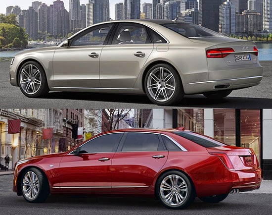
I am comparing it to the A8 for 2 reasons. They both have that 3 windows side design.
And, so far, I never really liked the A8. I thought it was always the most boring looking choose in a luxury sedan.
Until now. Until I saw the CT6.
I mean look at both cars. The current A8 came out in 2009 and it looks more modern than the “not even out yet” Cadillac.
The difference will be even greater when the next A8 comes out. (Unless Audi ruins it like they did with the Q7)
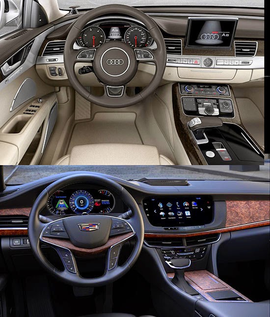
But inside, I must say, I do prefer the Cadillac.
It’s not a matter of color. ( I couldn’t find an official shot with a black interior for the Audi)
But I really hate that big “brush metal strip” Audi is using more and more.
(It is even worse in the new Q7 and upcoming A4) I mean the whole thing almost looks like a mess.
So basically, I’d rather be inside the CT6.
(Maybe you could keep your eyes closed until you get inside your car ?)
It will also depend on price.
If the same crazy guys who decided the ELR is worth $75 000 are in charge of pricing the CT6, they are in trouble.
The slow selling CTS starts at about $40 000 (After a price drop their new CEO said would never happen)
So this could maybe start at $50 000. Or $55 000 at the most.
If they think they can demand the same $74 000 as the Audi A8, all I can say is: Good luck…
I think the exterior designs of both cars simply carry the design traits of their respective brands, but do absolutely nothing to advance their brands' design language. I can almost overlook it with the Audi considering its age, but it's not excusable for the new Cadillac. To me, Mercedes does the best job of allowing its flagship sedan to set the design lead for its other sedans.
I don't think the exterior design of the A8 looks particularly better or more modern than the CT6. In fact, I think I prefer the exterior of the CT6 over the A8. Also, (other than lighting elements) I seriously doubt that the exterior design of the next gen A8 will be very adventurous or groundbreaking (if Audi stays true to form).
As far as the interiors, I think I prefer the A8 over the CT6. The interior of the A8 looks more interesting. I also prefer the more high tech look of tastefully applied metal finishes utilized by the A8 instead of the big slab of wood appearance of the CT6 dashboard.
I agree that both exterior designs are rather conservative, but I disagree on the desirability levels of the exteriors and interiors. I guess it all comes down to a matter of personal preferences.
Personally, I think the interior of the CT6 is horrible. What kind of crappy wood did they use and why is it everywhere? It looks like four different people with four different design ideas created the interior without talking to one another….terrible.
Cadillac is the clear winner here–inside & out. Simply no contest. Wood is much better on Cad. Screen is bigger.
Thank God they didn't dumb it down like the S/Maybach mess! The "new" S looks about as new & exciting as a 1996 "melted mouse" Taurus. It's about time somebody start creating crisp, magnanimous luxury cars!
I remember when lineups used to do the "trickle down" instead of the "trickle up" effect as far as advancing design (instead of just features). Only Mercedes is capable of this these days.
– FusioptimaSX
So many jaw-dropping concept cars from Cadillac over the last couple years and then… this. How incredibly disappointing. This was yet another half-hearted attempt by GM. They could have done so much better, including the forgettable name.
The Cadillac seem like a decent design to me but the radio without knobs is very 5 years ago. This is not something their age demographic or even younger kids in their 60's prefer.
Actually I think Cadillac should focus on continuing to improve their product instead of chasing the Germans on price. If you set the price to high from what the consumer thinks your worth, there's your problem.
Cadillac today has made great strides to improved their position from where they were in the '70s, '80s and '90s. From a senior land yacht into a serious global contender.
The CT6 is on par with the other players in the luxury market. Sure it may look clean, conservative and boring, but in a parking lot full of BMW's, Audi's, Mercedes, et/al I would pick the CT6.
There's nothing wrong with the interior/exterior. Cadillac represents "American Luxury" not European or Asian.
Why be a sheep in the flock, when you can be the wolf in the pack?
On a side note, I think it was a mistake to remove the wreath from the logo. It added character, now it just look's plain.
When there's nothing substantial to say about the virtues of a car, people complain about the style. I am an Audi fanboy, and unlike the previous generation A8/S8, the current A8/S8 is not a car I would ever consider. The platform of the CT6 is modern and the overall architecture should net a car that competes handily against the Germans, like the CTS has shown to. Yes, I would have preferred it to resemble the Elmiraj, but Cadillac's flagship won't be out for another year. The style of the CT6 is derivative, but it's got road presence, like the CTS does. And even though the CTS is selling fewer than the previous generation sold, that was completely intentional. The average transaction price of the new car is considerably higher than the outgoing CTS. Selling fewer cars, but making better cars, and a greater profit… that sounds like a winning formula to me.
more from the "Vegas, baby"Cadillac interior design team
How many people who publish their comments here are being paid by GM? I follow Vince Bulapp's page for more than five years now and I have never seen this amount of comments that are this long and surprisingly all favor the Cadillac. Read the comments about the new Verano and guess what? Just the same thing. I'm annoyed when I read that people write that the Verano's design “(…) is just perfect!”. Are we looking at the same cars? At least the CT6 has a clean design.
Let`s agree that the CT6 has a different approach: American luxury instead of European luxury. Yet, it's design is clearly uninspired, lacks personality. It also looks a little cheap IMO. I think there is no need to apologize, Vince. People read your blog because you have an opinion!
April 27, 2015 at 10:33 AM I disagree. If you grew up in an automotive world of "high style", like the America of the 1960s & 1970s; everything today looks simpleton, dumbed-down, uninspired. GM at least makes an effort. There is a HUGE pent-up demand for a product that nobody makes anymore. And the CT6 is the closest anybody has come to a full-size/high-style car in several decades. Personally, I drive a BMW. Not because of the engineering or performance. But because the dash–the part of the car I see most often–had more real wood, and is a classier design–than just about anything else. I don't find it as attractive at the Cadillac pictured here. Or as attractive as the latest Lincoln Continental show car. But it was the closest I could get to those cars the day that I decided I needed a new car. So it's not that people like me are GM fans; we just appreciate good design–we enjoy the art. And there ain't many uniquely yet attractively styled cars out there to enjoy these days! If Cadillac can get their even bigger sedan to marked before my Bimmer wears out–my next car will once again the car with the most attractive interior–and next time it will probably be a GM (Cadillac).