That Cadillac CT6 Butt…

Last Updated:

Yesterday, GM released a bunch of official pictures of the all new CTS.
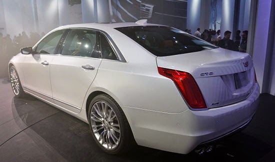
But I couldn’t find any from from a rear angle.
This is why…
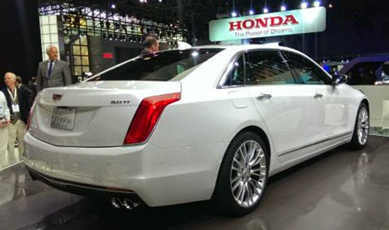
It looks pretty bad from there. (And they don’t really want you to see it.)

It has the same problem as the CTS.
It seems so weird that after all the criticism they got about the CTS rear design, they didn’t listen.
And did the exact same thing on a larger car (???)
(Or maybe it was just too late to change anything?)

Just like on the CTS, it looks awkward and rather cheap. Like an afterthought. And it doesn’t fit the rest of the car.

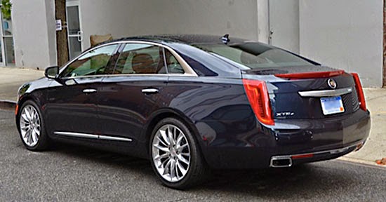
Call me crazy, but I still think the XTS, from that angle, is much better looking.
The tail lights sticking out a little bit, trunk etc…
The whole thing is just so much more peasant to look at. And more modern and original.

I bet these probably make great used cars now…

Conversation 12 comments

  1. The CT6 looks better without the CHMSL and is more pleasing overall, IMO, but a lot of people won't be able to tell the two apart.

    Did they honestly expect the world to go bonkers over this car after all the years of this design language?

    My advice is to dare a lot better next time.

  2. You couldn't find any pics of the rear of the CT6 because you think Cadillac is trying to hide it? But they designed it so why would they try to hid it in photos? Maybe if they made it a hatchback you'd be happy.

  3. Agree with you on the tail lights. Vince, maybe you can post a pic of the Jaguar XJ's tail lights next to the new CT6's… hmmmm. I have a lot more to complain about regarding the new CT6's design, especially after seducing everyone with the Ciel and then the El Mirage, but why they are down playing the most iconic design element of the brand – fin like tail lights – I have no idea!
    GVdesignsells

  4. Agreed. The XTS has that dreadful overhang, but what they did with the lights on it, the SRX and the ELR was a good direction, with making them into subtle fins. Distinctly Cadillac without being tacky.

    The back of the CT6 looks like a rental car with the flat lights, no prominent CHMSL (which has been a styling point for a quite a while) and not even a touch of chrome or anything on the trunk. Add in the forlorn crest that has lost its wreath and it is just very forgettable.

    No idea why the watered down the Elmiraj that everyone loved so much. This whole design looks incredibly safe from a company that is now supposed to be so "daring."

  5. Cadillac's rear is a major design weakness. It is like Acura's beak. And neither carmaker is willing to listen.

  6. With all the dramatic concepts Cadillac has shown over the past 5 years they come out with this vanilla blob. Ed Welburn…what WERE you thinking the day you signed off on this?!
    And that name…CT6? Sounds like a bathroom cleanser rather than a Cadillac Flagship.

  7. Surprised to say I agree, even tho I'm not a fan of XTS proportions over all.
    I think an error of CT6's butt is too much flush surfacing. Aerodynamically accomplished, yet lacking in horizontal shadowing, to break up the mass. Also a hazard associated with the must-have vertical tail lamp element– almost all other cars have the advantage of a horizontal or angling or flared, roughly rectangular slab to break up the trunk back.
    White paint also accentuates the bulbous bluntness…

  8. April 2, 2015 at 7:42 AM
    I think the tail lights may have been "dumbed down" to improve aerodynamics (for government-mandated CAFE decrees)

  9. I totally agree with you on this one. I think the entire CT6 is a disappointment. There is nothing distinctive or desirable about the exterior or interior designs. It almost seems like Cadillac just expected the public to go crazy over this car because it's a fullsize RWD sedan. There are established players in this segment that Cadillac will be competing against with this car. Cadillac needed some kind of visual Wow factor, but this car is sorely missing anything of the sort.

    Personally, I think the current Mercedes S-Class rules this segment in regards to exterior/interior design. I didn't expect Cadillac to issue a copycat lookalike of the S-Class, but I did expect Cadillac to create something with its own distinctive design language that would attract attention to this vehicle. It may have the goods underneath the skin, but I don't think the packaging is going to appeal to anyone other than someone who is already a die hard Cadillac fan.

    Cadillac definitely bunted when it needed to hit a home run. What a shame and disappointment.

  10. I agree with the XJ comment, that was on my mind too. The XJ's look grew on me as its original, but the rear of the ATS, CTS, XTS, and CT6 all look the same! The XTS and the ELR are the most unique.

  11. Damn, they couldn't even come out with a new wheel design for an all-new car? Looks like the exact same ones on the XTS!

Leave a comment

Your email address will not be published. Required fields are marked *