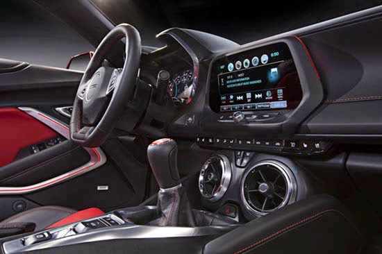
2016 Chevrolet Camaro: The better pix
Last Updated:
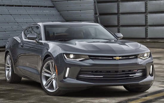
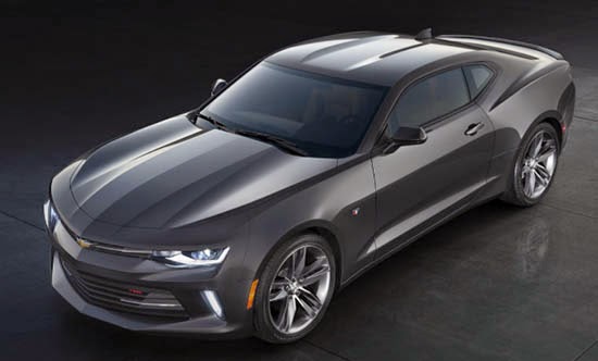
This is looking really nice.
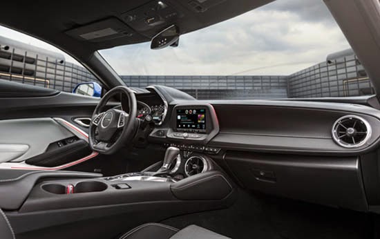
Although, like I mentioned earlier, the interior still looks pretty “cheesy” to me.
This is way too busy.
I am really not a big fan of the 2015 Mustang interior, and still have a hard time getting used to it. So I was hoping the Camaro would be much better. But this looks really, really busy.
Like if they took the current interior and added a bunch of stuff, shapes, everywhere.
At least, GM is mentioning much higher grade interior plastics.
Engines are what I mentioned earlier.
-2.0 Liter Turbo with 270HP
-3.6 Liter V6 with 330HP
-6.2 Liter V8 with 455HP. Available with a 6 speed manual or 8 speed Automatic.
So there is something for everyone.
That dash is just plain weird. Agree it's too busy and who approved air vents mounted at the shifter level? This is really a sad day for Camaro.
It looks like designs for 5 different cars were all thrown in a blender and there it is…
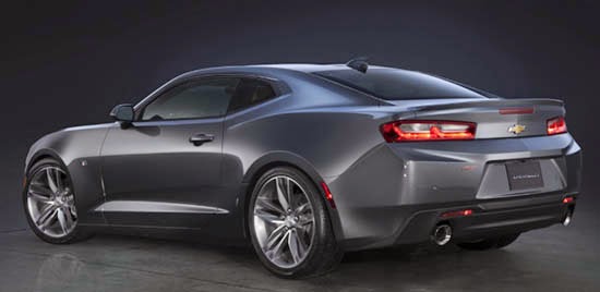
1. The shark fin on the roof is way to "fin". Should have done something much lower profile.
2. The 3rd brake light. UM – it's 2015. Hide it inside behind the glass like so many others do. It's an eyesore.
3. Speaking of eyesore = GM it's time to UPDATE that old gold bow tie. At least shift it to stainless steel or brushed aluminum. It's an aged color – and it shows.
I totally disagree with the disparaging remarks about the dash design. It has a fresh take on retro, ESPECIALLY the air vents, which remind me of the early under-the-dash units when air conditioning was not prevalent.
Instruments focused on the driver, emphasized by that sweeping white space to the right.
Exterior is a big improvement over previous generation, which was not bad. Front grilles thoughtfully original.