2016 Mercedes GLC
Last Updated:
The new GLC replaces the GLK.
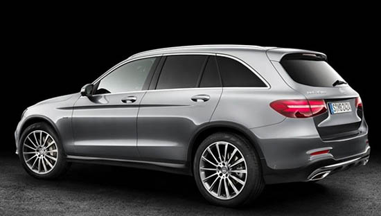
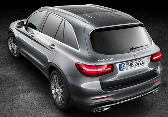
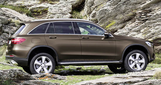
And with a new name comes an all new, more rounded shape.
Gone is the super square look of the GLK. Which I am sure, many will miss (But not me)
Even though I never liked the look of the GLK, it was, at least, a bit original.
This is now just a Crossover version of the new C Class.
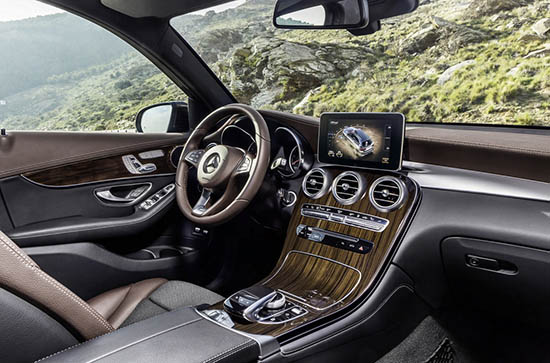
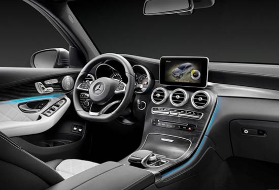
The good part is, that it inherit the C Class great interior. Which is miles ahead of the of GLK.
And also much better than the cheaper GLA.
Not sure about engines for the US yet, but they should match what we are getting here in the C Class.
What do you think?
Are you missing the GLK already?
Looks like an Audi with a Benz nose.
IOW, boring as hell.
Exterior looks like the NEW Lincoln MKC (without the Lincoln's flare). Inside is interesting, if not a little busy. But like BMW owners, anyone looking for the "perception" of wealth will flock to it in droves!
1. looks nothing like and Audi
2. Yes it has a Benz nose. It is a Benz.
3. Looks nothing like the MKC. That car has a split wing grille, fender flares, Audi-ish tailgate, full width taillights, etc etc etc.
4. BMW/Benz hate is ever present!
It's ok, I'm not pretending it is daring or dangerous. But it sure the hell isn't a clone of anyone else's design either. It looks like a crossover-ized C-class wagon. Which, um, it actually is.
It lloks ok. Kind of late to the party, but descent effort. It had better have more rear passenger legroom. The current model had a nervous ride and never came across to me as a premium product.
Clearly a step backwards from the car it replaces. But still, on the inside at least, nicer than many in this category (like for instance, the Chevy Equinox, Audi A5, Ford, etc. And still on a par with the Dodge Journey, Cadillac, or Lexus rx. The exterior however, is not up to recent Mercedes standards–and not only uglier than the one it replaces–but uglier than anything else the same size.
I hate the way MB and BMW place the navi screen on top of the console like that. Looks tacky as Hell and like it's begging to be snapped off.
June 19, 2015 at 8:21 AM
EXACTLY. Poor design ideas (like the "flying screen") are why my last BMW…may very well be my LAST BMW. When does the CT6 come out?
I just do not like this. Interior or exterior. It just looks plain vulgar. It is as if Mercedes is trying too hard with this thing. But, as we all know badge whores have no shame and will insist on buying/leasing this just because of the Tri-blade logo. Criminal.
looks pretty fucking mundane to me. hard to understand the anger.
Hey, let's dump on it, because it is the only way Cadillac can look better…..