All new 2016 Honda Civic
Last Updated:
Here is it, the all new Civic.
The first thing I noticed was… the pictures!!
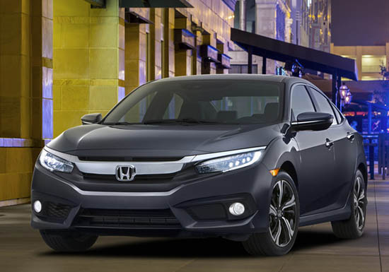
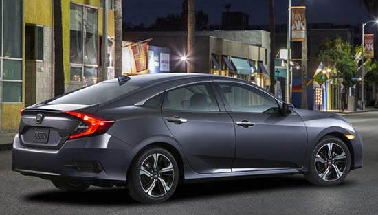
And how bad they are! I mean really. A huge company like Honda cannot hire a decent photographer to launch one of their most important model ever????
Look at that super crappy photoshop job on the top 2 photos.
This is really bad and gives a horrible first impression.
Now for the car. It does look super modern. (I think it could look great in better pix)
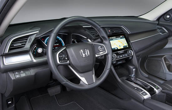
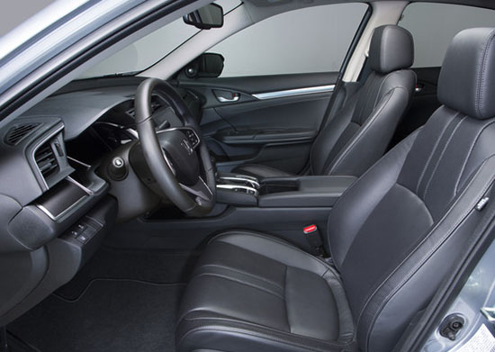
The interior seems pretty upscale. Despite the weird color on the shitty pix. (is it a black interior? Dark grey?)
Everything seems pretty high end for a compact car.
This could be great in person.
Engines are also new.
LX and EX models are getting a new 2.0 Liter with 158PH, and a 6 speed manual or CVT
EX-T and EX-L models get the 1.5 Liter Turbo with over 170HP. CVT only
Honda claims the 1.5 liter will get over 40MPG.
it looks much longer on the pictures but is only about an inch longer than the current model.
But about 2 inches wider.
Coupe and hatchback versions are coming out later.
More soon. (Maybe even better pix…)
What do you think?
I like the profile alot, as it presents as a much more upscale and contemporary design. However, that being said, I believe they dropped the ball when designing the front clip and grill. Not as bad as Toyota or Lexus's latest offerings, but not as upscale as the profile leads to. The interior is also well designed and thoroughly modern in it's execution, and materials appear to be of good quality. Overall, the nicest Honda sedan in recent memory. A win for sure.
Okay.
Is anyone else seeing a hint of Crosstour in the profile/rear end design?
Glad to see they moved the side mirror back onto the A pillar from the doors.
I think it looks great. Honda styling finally heading in a good direction. Looks better than any current Acura sedan, and it does look upscale.
Though I am not a fan of Honda's recent character lines on the sides. They have too many lines that dont relate to each other and dont complement/flow together, as if they mashed up two different designs, one for the nose and front fenders, and a separate design for the side and butt of the car.
Vince,
They don't look like pictures at all, I think they are CAD renders.
The exterior is just more of the same "Japanese Gothic" style. I find it way too busy, but maybe the kids with 8-second attention spans like it. I think they need polygonal surfacing features every few inches because they've already forgotten what the front looked like by the time they get to the back.
Maybe the interior will look good in color, but it's just a big depressing lump of coal in grey. It reminds me of 70s American cars where every single surface was color-coordinated, so it looked like a paint bomb went off inside the car. Only, in this case, it wasn't even color paint.
Those wheels look terrible. Are they really hub caps?!
Agreed – they needed to put more effort into the photography of it.
One of the most impressive (for class) cars I've seen in a long time. The car seems to be spot-on. Very little change from "concept" to production. Although, I believe we've only seen the high trim level. The Civic seen here is probably an EX-Touring model that will probably come with everything standard. It will be interesting to see what the EX trim and hatch models look like.
I am thrilled that they are getting back to basics and offering the 6 speed manual transmission on the EX models. Most winter climates here in the northeast Ohio, Pa and New York call for it. I agree about the pics! I am an Art Director and noticed it right away. Premiering a new car in that crap color? I have hated that horrible colorless gray from Honda for years.
This looks great! I really love the looks of it and it should easily outsell all the other compact sedans out there…..
I agree. Pictures suck. Even the rear and taillights look out of proportion now.
Pictures are probably HDR merged pictures giving that artificial look (you see that sadly also a lot in real estate).
Weird that a hatchback is coming while this looks like one but isn't.
I like the design but typically most US buyers prefer sedan look. But regardless good that they are willing to take some risk and not another boring design iteration.
Nailed it, well done Honda!
OMG Vince, I agree with you 100%. That is horrible Photoshop. I wasn't paying attention to the background when i was looking at the car, but after you mentioned how bad the photographer was, i noticed another flaw.
Look at the areas around the fog lights on pic 1. The mesh netting plastic part right next to the fog light is missing on one side, but present on the other. Seriously. Seriously. Honda is rich, they could have got real pics and locations, with better lighting.
And yes i also agree; what the hell color is that leather interior?
With that tiny trunk opening, why not make this a hatch instead. Tesla buyers don't seem to minds and I would love to have a more sedan styling with the convenience of a hatch.
A commenter here reminded me of something that seems to be true at Honda Design these days…
When I was little, Matchbox cars were the faithful reproduction cars for kids, and HotWheels were the whacked out, overblown, disproportionate cars that excited kids. Like Barbie, if you scaled them to a real car, it would look freakish. This seems like the problem Honda is having navigating. Renderings and models are great, but seeing the front end, all those side character lines, or even the multitudes of lines on the trunk surfaces just makes me think I'll get tired of this fast. Hondas were always best when the forms were clean. I hope I'll like this in person, but my 'bad design detector' is pinging pretty hard and I expect it will lose the Civic-ness, which was always pretty good.
I have to agree with you on the pics. You think Honda would want to represent this great looking new Civic in a better light.
Final verdict: Awesome looking new car (inside and out) let down by some incredibly horrid photos.
The Acura ILX is in trouble now, what is the point of getting a ILX now that the Civic looks so much more classier.