2017 Mercedes SL
Last Updated:
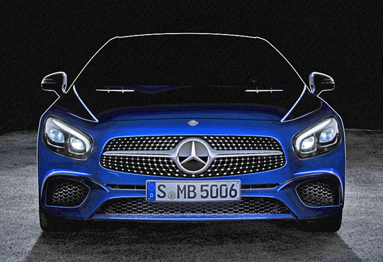
Looking all new from this picture, but it’s not.
It’s just one of these “mid cycle revision”. At least it seems quite extensive. The whole front end looks brand new.
I’ve always been a big fan of the SL. But the current version has to be the worse looking one of all.
Displaying an amount of design vulgarity never seen before in its history.
It just looks like it was designs by a bunch of guys who never talked to each other.
This new front end does look a bit cleaner. (Let’s hope it blends with the profile better.)
Don’t expect a new interior. Although I’m sure the screen has moved to the usual “Mercedes fake tablet look” on top of the dash.
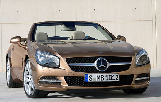
For reference, this is the current front end.
I will be seeing the new one next week at the Auto Show. And will make sure to post plenty of pictures!


I disagree with your opinion of the design. I like it–for a mercedes. I mean, Design & Style have ALWAYS been weak points at Mercedes, but they certainly have improved in recent years and this too, I feel is an improvement. (It also helps that government over-regulation has meant that all cars are more similar than ever before; which has eliminated all of the really stellar and ground-breakingly gorgeous designs (of the past).)
Congratulations Mercedes Benz, you just achieved the look of a 3-year-old Dodge Charger. And to think that Hyundai was the only company dumbing-down designs….
Current one needs to go on a serious diet.
Looks like an older 6 series now..
Whelp, they've fixed the awful gnawing mess of a front end. But they haven't done enough to fix the rear rump because MB doesn't want to spend the money on modifying the unibody. Because they are only changing the plastic bits and front wings, they may not even have to put it through additional crash testing.