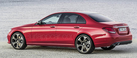
All new 2017 Mercedes E-Class
Last Updated:
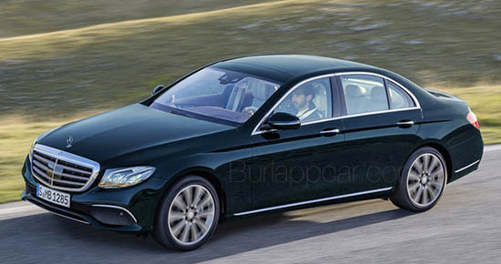
Finally we see the real thing (After discovering the interior a few weeks ago)
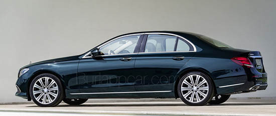
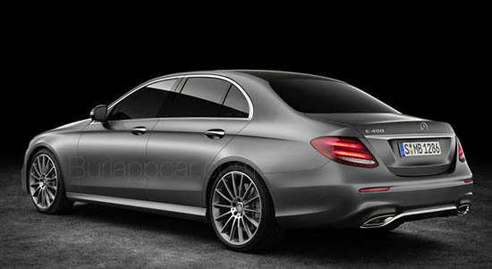
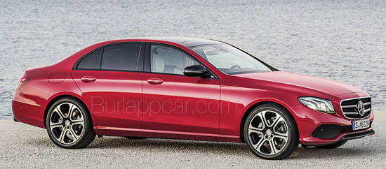
And it is exactly what was excepted. A larger C-class. Or a smaller S-class.
Although the design seems a bit simpler than these other models.
I think it does work very well. And will age pretty nicely too. Which is a great selling point for the E-class. Very tasteful, nothing obnoxious.
No one besides current Mercedes owners and car nerds will really notice this car.
Which is just fine. All it needs to do is say “Mercedes”.
And it does…
I'm splitting hairs, but it really does look mostly like a larger C-class to me (than a smaller S-class). I like the C, but the design looks even better at this size, and I agree, nice and simple, not busy or obnoxious.
If design-by-Xerox works for other German marques, why wouldn't it work for MB too? It's what the public wants, apparently
This design looks much better on the E than the C(in photos.) For some reason, when I finally saw the C on the streets, I said meh.
Zzzzzzzzz, sorry I fell asleep looking at this snooze fest. I'm sure it is well engineered and has fine craftsmanship, but this takes the case for laziest, most derivitive design.
It's better than the previous model, not as good as the one before that.
As for the C-class styling, I didn't like it at all when the car was new, but it really has grown on me. Some colors suit t much better than others, though.
try a little harder to be new and inventive, this is boring
A thicker C-pillar might have helped to make it look more S than C, but it is way better than the current model.
Mercedes has fallen into formulaic humdrum. At least it ain't ugly. Looks like Gorden Wagener has finally let somebody else handle the aesthetics as the recent MB form language isn't nearly as gauche as just a few cycles ago.
Really nice- so smooth.