2018 Honda Odyssey
Last Updated:
A few things come to mind here. Like:
– WTF?
-What were they thinking?
-Has Honda completely lost it?
-Who designed this crap?
-Why make it worse than before?
-Was this designed in China?
-Who authorized this?
-Why am I looking at this?
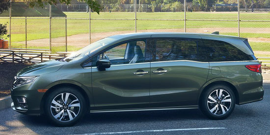
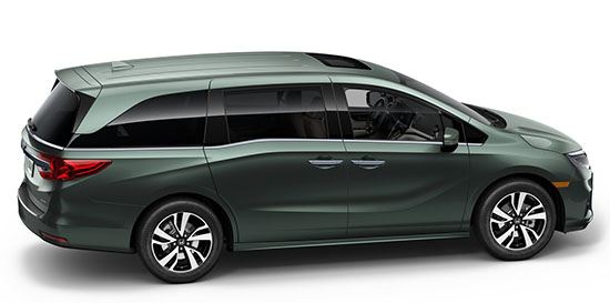
This is pretty terrible. I mean these weird wavy lines on the side never really work. Just ask Mazda with their second generation Mazda5.
This is just one of the worst visual mess I have ever seen.
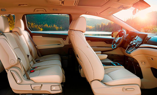
And that interior looks like it was designed by a robot.
I cannot believe this is an all new van. But Honda claims a new chassis.
Still powered by the 3.5 Liter V6. Now with 280HP.
With a 9 or 10 speed auto. Depending on versions.
And look at that tiny sunroof option! So 1995.
I mean this really look like a step backward for Honda. It makes the Chrysler Pacifica look like something out of a Science Fiction movie.
First we got the weird (horrible) looking Fit. Then the messy Civic Hatchback.
And now this.
It really does feel like Honda has moved al of its design studio to China.
And, I wonder how they will ruin the 2018 Accord…
(It is already half way there with the terrible facelift from last year)
Given how good the Civic and and CRV look, I am surprised how little effort went into the Odyssey. You are right, it looks terrible and that stupid wave on the side has GOT TO GO!
It's no uglier than most minivans on the market.Only the Pacifica looks decent in this segment.
a slouch assed mess of the highest order. After being in a rear end collision, this is what you would expect a normal van to look like…..yes, after being hit!!!
What is wrong with Japanese design lately? They go from minimal design to way overdone with lines going in every direction that make no sense. I am only hoping that the Odyssey does not inspire Toyota to come out with an even uglier Sienna.
Who even buys minivans in 2017,anyway?
I thought that all the soccer-moms were driving SUVs nowadays.
I actually don't think it looks bad at all. It's an evolution of the current design which they seemed confident with….plus this time the sliding door track in finally hidden!
Looks like an elephant sat on the back end of the van; but, instead of fixing it, they just repaired the roofline. Someone forgot to finish the design.
A minivan is a minivan is a minivan. Are you looking for style in this segment? Come on.
I'm heart broken honda.
No longer just an oppy mommymobile. NOW EVEN MORE MUCH "OPPYIER"ier of a Mommymobileierer.
The side creases (or let's say that cacophony of lines) make it look like it's either bent in the middle or has already been involved in a side crash…
Also I think the implementation of digital instruments is one of the worst in this car
For all the haters, give it time and it will grow on you and then you will see what Honda was trying to do.
Why why why would anyone think a droopy saggy rear end was attractive???
Aww, someone dented their side doo… WAIT! They are supposed to look like that? What the hell is this mess. A hate unnecessary accent lines, bulges and drops for no reason.
Honda is finished Vince P
Pssst. Honda is on the downslope and it's slippery as f~<# ….greased with poor design and arrogance