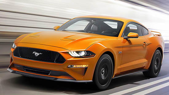
More on the 2018 Ford Mustang
Not much really.
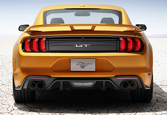
You can see the rear lights were redesigned as well.
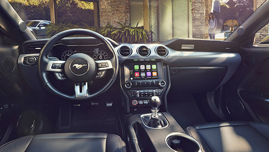
Inside it’s pretty much the same.
Which means about 1000 textures all mixed up into one interior. The console still looks out of place somehow. That whole interior never felt cohesive, and nothing here improves.
There is an optional 12 inch digital gauge screen.
I don’t like these. I’d rather have old fashion gauges.
But these are now getting cheaper to produce than the regular ones, so all car makers are pushing them on us. Claiming they are better…
I think they are just a gimmick. And now, a way for them to squeeze an extra buck in profit.
The new 10 speed auto is available in both engines, not jus the V8.
I just wonder how that feels, 10 speed. I mean it must be constantly shifting.
They also claim there are 10 new wheel designs to pick from. 12 total.
More soon.


