Maybach Ultimate Luxury concept: why???
Last Updated:
Everyone was expecting a Maybach version of the upcoming redesigned Mercedes GLS.
And I guess everyone was wrong. Instead, they chose an original design for their concept .
Which is fine.
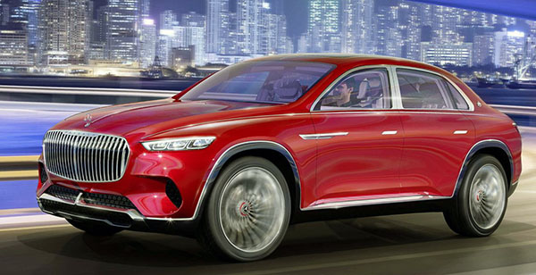
They use the same grille as the gorgeous convertible concept we saw a while ago.
(The grille was actually the worst part of it)
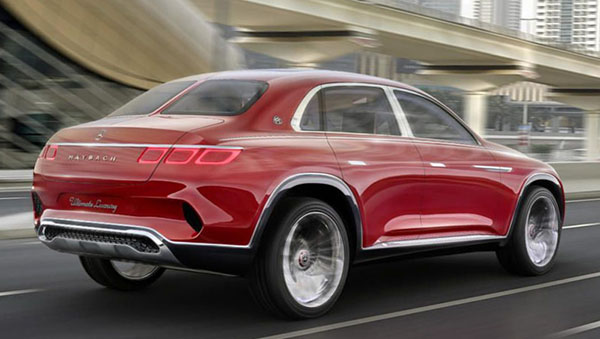
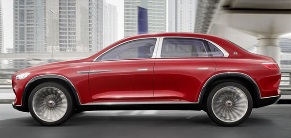
Instead of designing a luxury SUV, they made a raised up sedan with a short, stubby trunk.
Which never works. (And look at that “split rear window for no reason”)
AMC, Subaru and Volvo have all tried it before. And it always ended up looking goofy and much worse than the raised wagon versions.
Not sure why Mercedes chose this weirdo design solution to show off something called “ultimate luxury”.
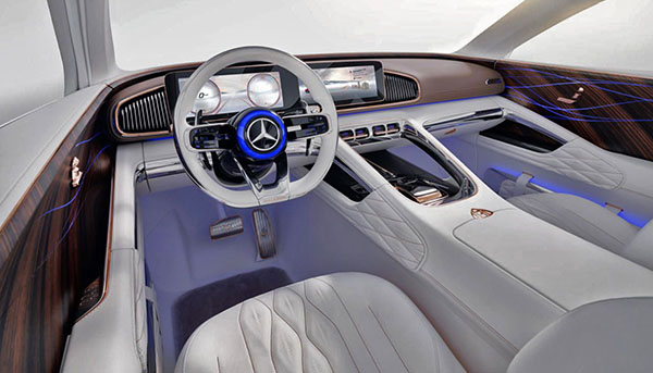
Also, as I mentioned before, the interior is not “ultimate luxury”. As it really pushes the boundaries of how vulgar a car interior can be.
Again, someone mentioned in my earlier post that rich people with actually taste would rather buy a Range Rover 2 door. And I agree 100%.
I really expect them to fill the car with clowns during the official presentation because that is exactly what it looks like, a clown car.
Looks like an updated AMC Pacer model! LOL!
Honestly, I never thought I would say this in a hundred thousand million years… this grill makes the Lexus monstrosity look Awesome.
The Kia K900 isn't looking so bad now 🙁
Like it or not, I think this is the future of sedans, now that traditional sedan sales have tanked due to all the crossovers. Manufacturers are not going invest in sedan proportioned architecture, just due to the low volume numbers, and we will see the things like a new Lincoln Continental, a new Chevy Caprice and a Ford LTD all based on the more popular SUVs… just notch back versions… to save development costs.
They will look chunky and awkward… but trust me, it'll happen
(that is.. of course… if they don't get replaced by self-driving toaster-looking thingy's)
This comment has been removed by the author.
The issue with Maybach is no brand identity or equity. Rolls Royce and Bentley have been able to become modern and relevant. Mercedes treats Maybach as a flanker rather than it’s own stand alone brand.
Looks like donk cars were ahead of their time.
Why??? Why not!
The best of no worlds! The three box shape looks hideous when it’s beefed up and jacked up to mimic a crossover and it severely limits the utility of the vehicle! If sedans are dying, please let them die gracefully! Don’t disfigure them in this shameful manner!
This monstrosity reminds me of that ungainly Lincoln Navicross Concept from 2003. An answer to a question that no one was asking. Lucky for us that it remained just a concept!
Some cars are ugly looking. This isn’t ugly looking. It’s stupid looking.
DONK!
"If sedans are dying, please let them die gracefully! Don’t disfigure them in this shameful manner!" is maybe the best comment here so far.
The Rolls Royce Phantom is a tall sedan done right. They should check that out.
Please tell me this is a joke!
If I had a billion dollars I’d totally buy this. Thank goodness I don’t.
Why? … Becau$e.
This is gross. Even if you had the money, you wouldn't want to spend it on this ostentatious chrome turd if you had an ounce of class.