More pictures of the Rolls Royce Cullinan
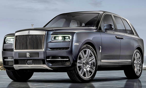
Still terrible, even in a more normal color.
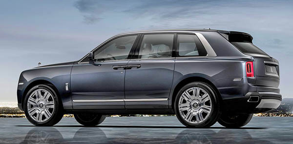
That profile is just ridiculous, and looks like a box.
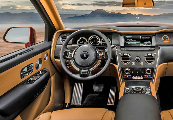
There is just zero design here…
It is just gross.
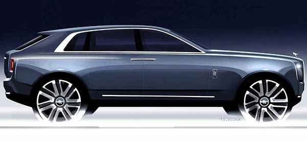
This is actually a really interesting official sketch. Showing, I guess, what they were going for in the first place.
Which wasn’t that bad!
What went so wrong between this and the production design???