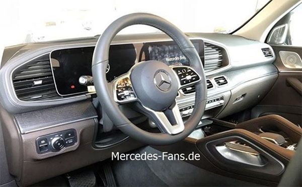
2019 Mercedes GLE interior
Last Updated:
It looks like Mercedes did a good job making sure the new GLE interior isn’t a clone of the E-Class.
Although their recent exterior designs are getting simpler, their interiors seem to be more complicated every time.
With lots of lines, textures and shapes that don’t necessarily go together.
I guess nicer, official pictures will give us a much better idea.
(If they can avoid turning on that cheesy “blue mood lighting”…)
This is a situation where I would rather it just had an E class interior…. WHAT THE HELL IS GOING ON ON EITHER SIDE OF THE SCREEENS. That shape is horrible. A large ugly air vent on the left but on the right it appears to be just horizontal lines contained within an ugly shape!!!. With the amazing interiors MB has been turning out lately I had high hopes for the new GLE….
Looks like a dashboard design from a 1980's Mazda.
Why is there a grab handle for the driver on the console?
Symmetry?