2020 Mercedes GLE
Last Updated:
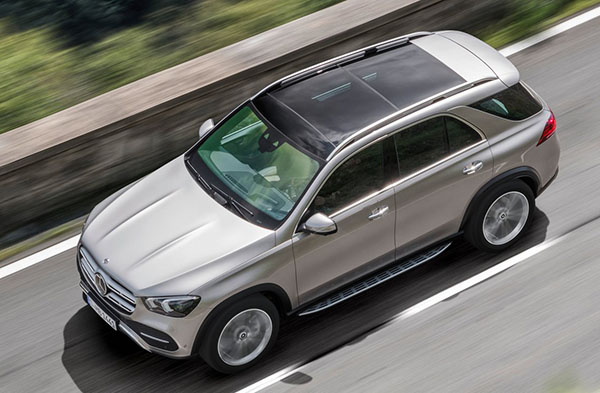
This actually looks much better than I though it would.
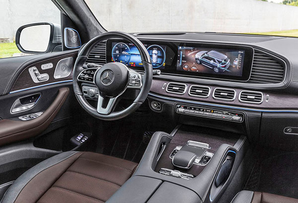
Inside too…
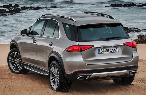
The exterior is very clean (like recent Mercedes designs). Yet retains the DNA of previous generations.
This is a really nice, understated, simple and grown up design.
(I mean, compare this to the Lexus RX….)
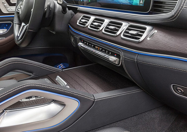
I think the interior looks good too. The dash is inspired by last year’s Maybach concept.
And it does look quite upscale. (Still too bad Mercedes insists on showing official pix with photoshopped cheesy blue ambient light… Why???)
Power comes from Mercedes’s new inline 6 cylinder (also used in the new CLS) with 367HP and a 9 speed automatic. A plug-in hybrid version will follow later.
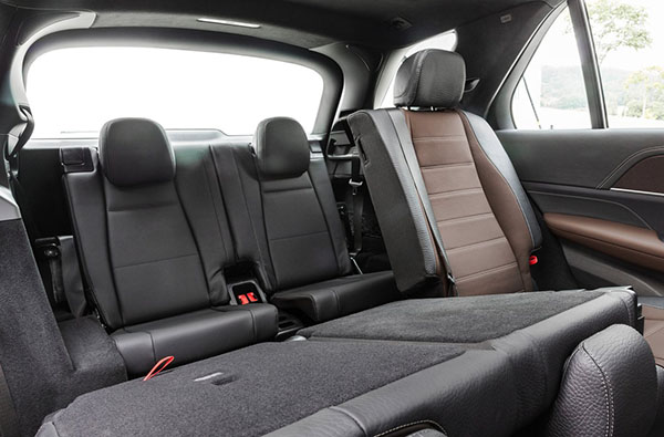
The new GLE will also offer a 3rd row option for the first time.
It doesn’t look really big in these pictures, but the wheelbase is about 3 inches longer.
So it should be roomier than before.
No price yet, but the current model starts at around $52 000. Which is quite a step up from the $40 000 GLC.
Also up from the $41 000 Lexus RX.
It only looks like a bargain when compared to the BMW X5 at about $56 000…
The all new GLE will be available in Europe and the US early 2019.
I like it a lot. Mercedes has always been great at making large cars look smaller.
Rear rnd is best view.
Is that a console mounted shifter finally??
Looks bland in styling! Rounded look is not for me I guess!
12 inch increase in wheelbase? You may want to check those specs again.
Oh no. So ugly, inside and out. Looks like it should have been the previous generation. Boring.
*In Chandler voice*
“Could there *be* any more air vents?”
Still like it tho. Plain but modern. Probably will age well.
Absolutely correct about the wheelbase. It is only about 3 inches longer, not 12.
My mistake…
What a nice looking vehicle.
Definitely will be getting plenty of sales compare to that piranha Lexus…sorry, but when spending that kind of mo ey, I want an attractive vehicle, not something that looks like it just came from the sea.
Audi and Landrover have this beat. This exterior design looks dated already to me.
ONE THING! ONE LITTLE THING is making all the difference. It that stupid horizontal fake air vent looking thing to the right of the infotainment screen wasn't there, this interior would be stunning! But that one thing ruins the whole thing. What is it? who thinks it looks good? Seriously, cover up that ugliness with your finger and look how good the rest of it looks. The round vents from the E-class probably would have looked better too but then I'm sure you would all complain that all the interiors are the same.
Changed my opinion of the new GLE. It is pretty sharp inside and out!